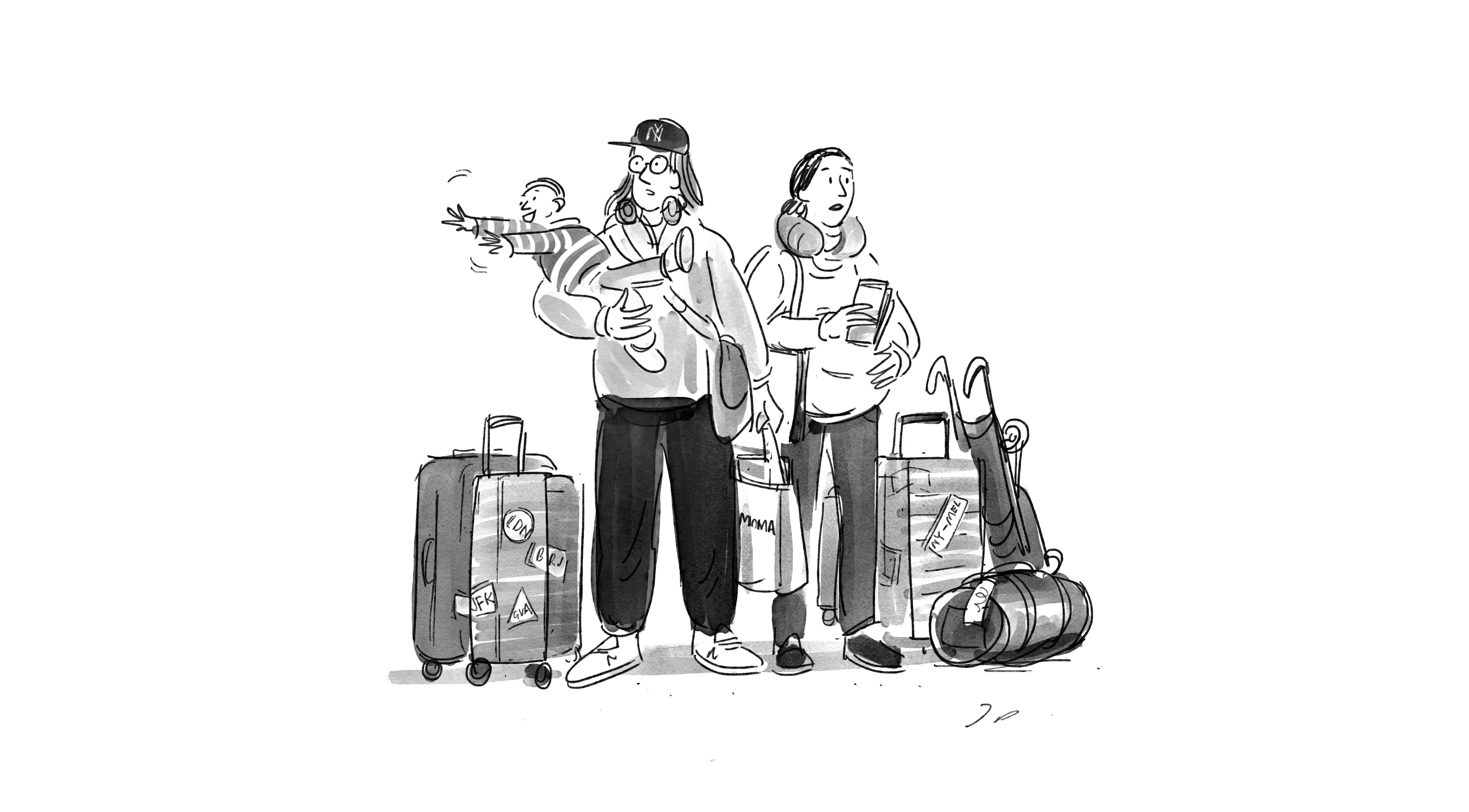
Blanding, or the Branding Paradox
In my 25 years in this business, I’ve come to believe one thing above all others: Brands are like people. Some are understated. Some are loud. Some are funny. Some communicate exclusively by exclaiming! Some have terrible grammar. Some, you imagine, have great abs.
As with people, brands aren’t created in a vacuum; they’re products of the world around them. Formed in relief around the strengths and weaknesses of the competition, a brand is as much about what it isn’t as what it is. The point is differentiation; by definition, that’s what branding is. Which is precisely why I’m so baffled by the current epidemic of what I call blanding—branding designed not to stand out at all, but to blend in. With results that are, in a word, bland.
The main offenders are in tech, where a new army of clones wears a uniform of brand camouflage. The formula is sort of a brand paint-by-numbers. Start with a made-up-word name. Put it in a sans-serif typeface. Make it clean and readable, with just the right amount of white space. Use a direct tone of voice. Nope, no need for a logo. Maybe throw in some cheerful illustrations; people like those. Just don’t forget the vibrant colors. Bonus points for purple and turquoise. Blah blah blah.
And I do mean blah.
The Brands That Inspired the Blands
Apple. Google. Airbnb. Uber. Perhaps you’ve heard of them. These brands communicate in basic codes that function almost like signage. You might say it’s “intuitive” branding. The cues are all right there: youth, friendliness, progress, newness, nowness and, above all, tech. With the wild success of these companies, their shared visual language has become a diner placemat-treasure map for countless tech hopefuls. Let us call them: the blands.
Blands are like teenagers. They dress the same, talk the same, act the same. They loiter at the arcade and, sometimes, the food court. Like teenagers, blands don’t have a very defined sense of self or, if they do, they lack the confidence to be it. It’s a school-of-fish mentality where the comfort and safety of the familiar outweigh the risk of attracting too much attention. In identifying themselves through the looks and mannerisms of others, the only thing blands are saying about themselves is that they don’t have anything to say about themselves.
The Difference Between Brands and Blands—Show, Don’t Tell.
The problem is that the blands haven’t earned the branding they ape. The big tech companies have strong, simple visual identities that match their strong, simple products. In many cases, they are their product. Their branding has evolved to reflect their powerful missions. Google’s logo wasn’t always the pared-back wordmark you see today. It matured, lost its quirks (remember that exclamation point!), and became a better representation of the company over time, as Google itself grew up.
Unlike blands, the tech giants have a lot more brand power going for them than their samey logos. As I touched on in this interview, the big tech brands are strong because the services or products they offer are strong. They are their product. But they’re not only a what, they’re a who. And rather than telling who they are, they’re living it.
The same is true of success stories outside of tech. Take footwear company Veja. Famously, they don’t spend a dollar on marketing or advertising, and instead put their money into their products and into producing them sustainably. What a novel, daring idea. Or take REI. For the last four years the company has closed every one of its stores on Black Friday, the single biggest shopping day of the year, and paid its employees to spend the day outside. Who’s gonna hate those priorities? Or take Volvo, the inventor of the three-point seatbelt. Rather than keep that landmark 1959 patent to themselves, Volvo gave it away to the world. Why? Because it would save lives. Sixty years later, the company has pledged that by 2020 no one will be killed or seriously injured in a new Volvo. An impossible goal. Or is it? Doesn’t matter. This is not a company simply broadcasting a message of safety; it’s a company devoted to it.
Let’s face it. Who do you believe, the company that tells you they believe in something or the one that does something about it? My point exactly. If you have to tell people you’re innovative or disruptive or forward-thinking, you aren’t.
Sorry if that sounded a tad harsh. I got a little worked up there.
In design, simplicity has historically been treasured. But simplicity, historically, has also carried an implication of cleverness. Or ingenuity. Or personality. Or all of those things. Simplicity was a compliment. But these days, companies are content with the simplicity part of simplicity, without any of the things that used to define it. And that’s not a compliment; it’s insulting to all of us.
It all comes down to personality. Without that, there’s nothing for people to hang onto. Except possibly a sans-serif typeface in vibrant colors like purple and turquoise with cheerful illustrations. That’s when branding rings hollow and ends up backfiring—the so-called brandscape becomes a blandscape*, and everyone crowded within its slender spectrum is reduced to generic.
The Challenge of Omnichannel Branding
It’s easy to see why tech would embrace blanding so wholeheartedly. Many of the companies are young, they’re selling untested ideas, and they haven’t had time to cultivate a strong identity.
There is also a functional reason: bold colors and sans-serif type play well across the diverse media on which brands today must live. They scale up or down. They are legible on a screen, in a magazine, or on a billboard.
Perhaps it is unsurprising, then, that the blanding trend isn’t limited to tech. Even some of today’s most established brands have erased their identity and, in one turquoise swoop, neutered their brand. Take Peter Saville’s controversial redesign of Burberry’s wordmark. The radical use of a neutral type eliminated all decorative elements. In Burberry’s case, these details weren’t superfluous; they happened to evoke style and class and heritage and something nobody else had—something that was, for lack of a better word, Burberry. Celine, too, went minimal recently, killing its accent and adjusting the spacing of its wordmark to “enable a simplified and more balanced proportion” that is designed to read as well on Instagram as it does on the side of a building. Blanding, the suggestion seems to be, is just good business.
But there’s a logical fallacy. Just because simplicity is the easiest way to accommodate diverse platforms, doesn’t mean it’s the best. Omnichannel branding is a tremendous design challenge that should make companies more creative, not less.
Real Brands Blend Out
Blanding has left us with a cultural backwater of superficial brands that have been simplified to the graphic equivalent of a Trump tweet. I’m not advocating for getting back to fanciful, illustrative logos. I’m asking simply for brands to more expressive. That doesn’t mean loud, it just means personal. Honest. True. And Different.
The process of getting there is a little like therapy. It can be painful to dig down to find the truest sense of a brand, but it’s cathartic and it’s crucial. We’re always looking for the secret ingredient. Something elusive and un-obvious, A contradiction, a surprise. Something to talk about, believe in, tickle, intrigue, entertain, agree with or disagree with and hopefully not give you a rash. And if you do it right, you end up with a charismatic hybrid of the you that others see and the you that you want to see when you look in the mirror.
Does your company have a big nose? This is how people will remember you, whether you like it or not. So you might as well own it. Call your company Schnozz. Make a proboscis monkey your mascot. Donate a percentage of profits to preserving their habitat. Commission deluxe, XL facial tissues, brand them and give them to clients. Live the truth that big noses build character. Then translate that to visuals that feel like you, not somebody else. Just stay away from the sans-serif in vibrant colors like purple and turquoise and cheerful illustrations, okay?
Written by Base Design partner Thierry Brunfaut, and co-written with ex-Base writer and friend Tom Greenwood. Thanks Tom.
[An edited version of this article was published by FastCompany on Dec. 11th, 2018, under the title “The hottest branding trend of the year is also the worst”]
*My wholehearted apologies to anyone who may have been offended by the terms “blandscape” or “brandscape.” I know I was.