BaseMEL partnered with Close Company to define the brand from the ground up: strategy, name, identity, art direction and voice built around a single idea. Cosy Utility.
Cosy speaks to comfort, materiality and the warmth rooted in Irish culture. Utility reflects durability, service and the conviction that good furniture should perform as well as it looks. Together they define a brand that is both inviting and purposeful.
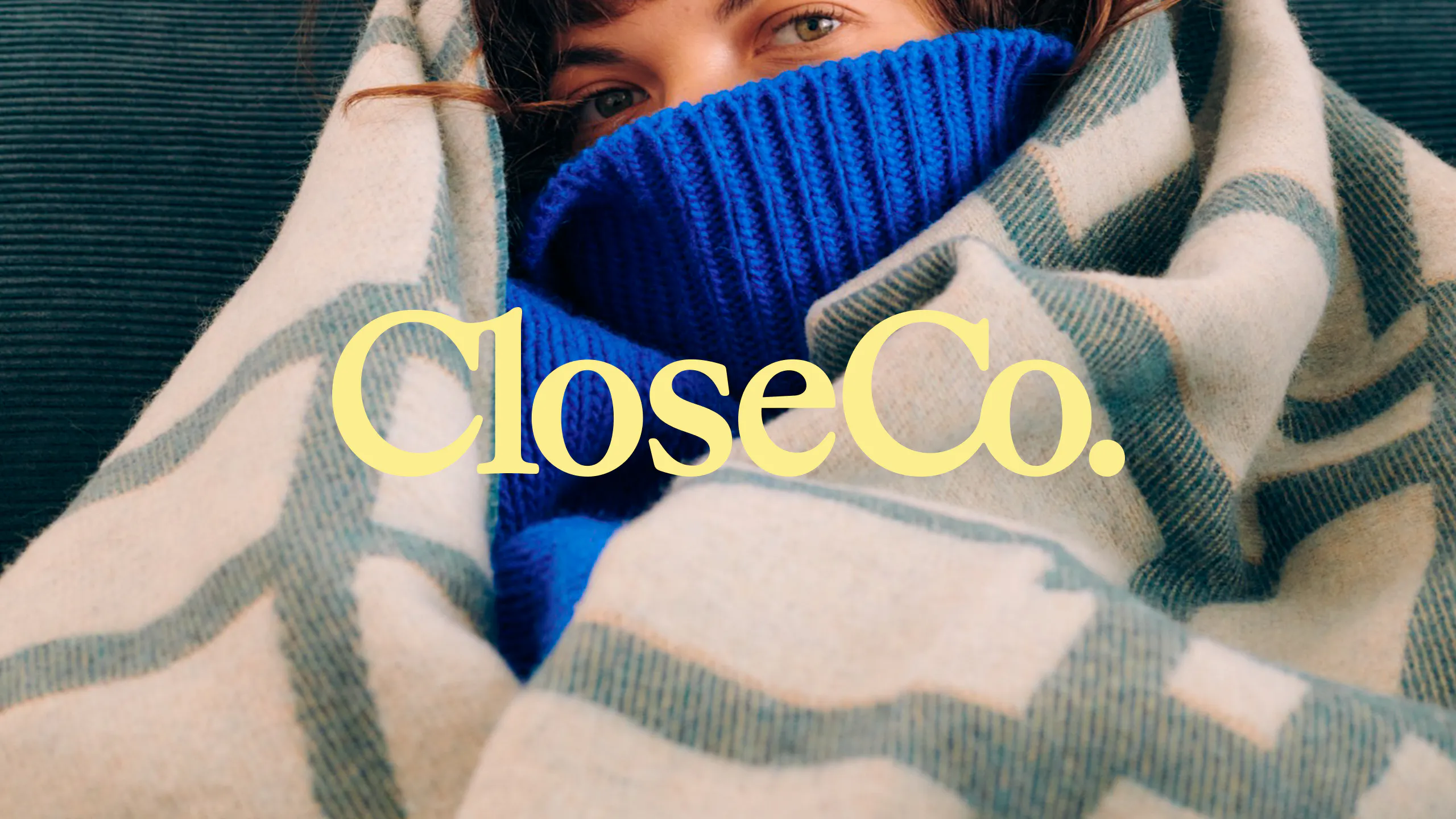
The idea shaped every layer of the identity. A bespoke logotype introduces subtle ligatures connecting the "Cl" and "Co", tightening letterforms to create a sense of closeness and familiarity. A soft rounded serif nods to craft heritage, paired with a utilitarian sans serif built for clarity. A bespoke logomark extends the ligature logic, with the abbreviated "CCo." folding together into a single cohesive mark.
Photography moves away from staged perfection toward real homes, real customers, and lived moments. Warm natural light, everyday objects and a genuine diversity of spaces make the point plainly: Close Company furniture belongs in real life. An eclectic illustration style extends this range, moving between playful iconographic moments and detailed editorial storytelling, providing a lively, geometric counterpoint to the photographic and videographic art direction.
The result is a new kind of furniture brand: rooted in Irish warmth, confident in its craft, and built for the realities of modern living.
{kind=image}
{kind=image}
{kind=image}
{kind=image}
{kind=image}
{kind=image}
{kind=image}
{kind=image}
{kind=image}
{kind=image}
{kind=image}
{kind=image}
{kind=image}
{kind=image}
{kind=image}
{kind=image}
{kind=image}
{kind=image}