{kind=image}
Studio BrusselTuned-In
Recapturing the edgy spirit of Belgium’s rebellious radio station
Once a driving force for Belgian youth culture, Studio Brussel had lost its edge. We helped the radio station reclaim its position as a leader in the country’s music sector through an identity and a typeface that assigns a visual voice to the sounds of a new generation. This rejuvenation began inside the company, and expanded to capture a fresh audience by way of engaging content that we brought alive through digital tools.
In the age of downloads and streaming services, radio still plays a vital role in discovering new musical talents, curating a sound of the moment, and forming communities of listeners. Studio Brussel – a popular Dutch-speaking radio station in Belgium – has done just that since it was founded in the 1980s. Through several genre shifts, visual campaigns and reinventions – just like the artists it supports – the station has continued to set trends and capture the zeitgeist.
Although it maintained a vivacious and youthful energy, Studio Brussel had lost its edge and become increasingly mainstream. The leadership decided to revamp the brand identity to revisit its Rock’n’Roll roots, reclaim the gritty spirit, and reconnect with its fan base of young people. Keeping its essence while igniting a shift in programming and content creation, we were able to rejuvenate the radio channel while reconnecting to its position as the major reference for music culture in Belgium.
This shift began inside the national broadcast company, involving the producers and hosts in the brand expression. The next step was to put music back at the forefront of content and visuals, in order to impact a new generation of listeners. Studio Brussel never took itself too seriously, so channeled its diversity and spontaneity into a more conscious brand vocabulary.
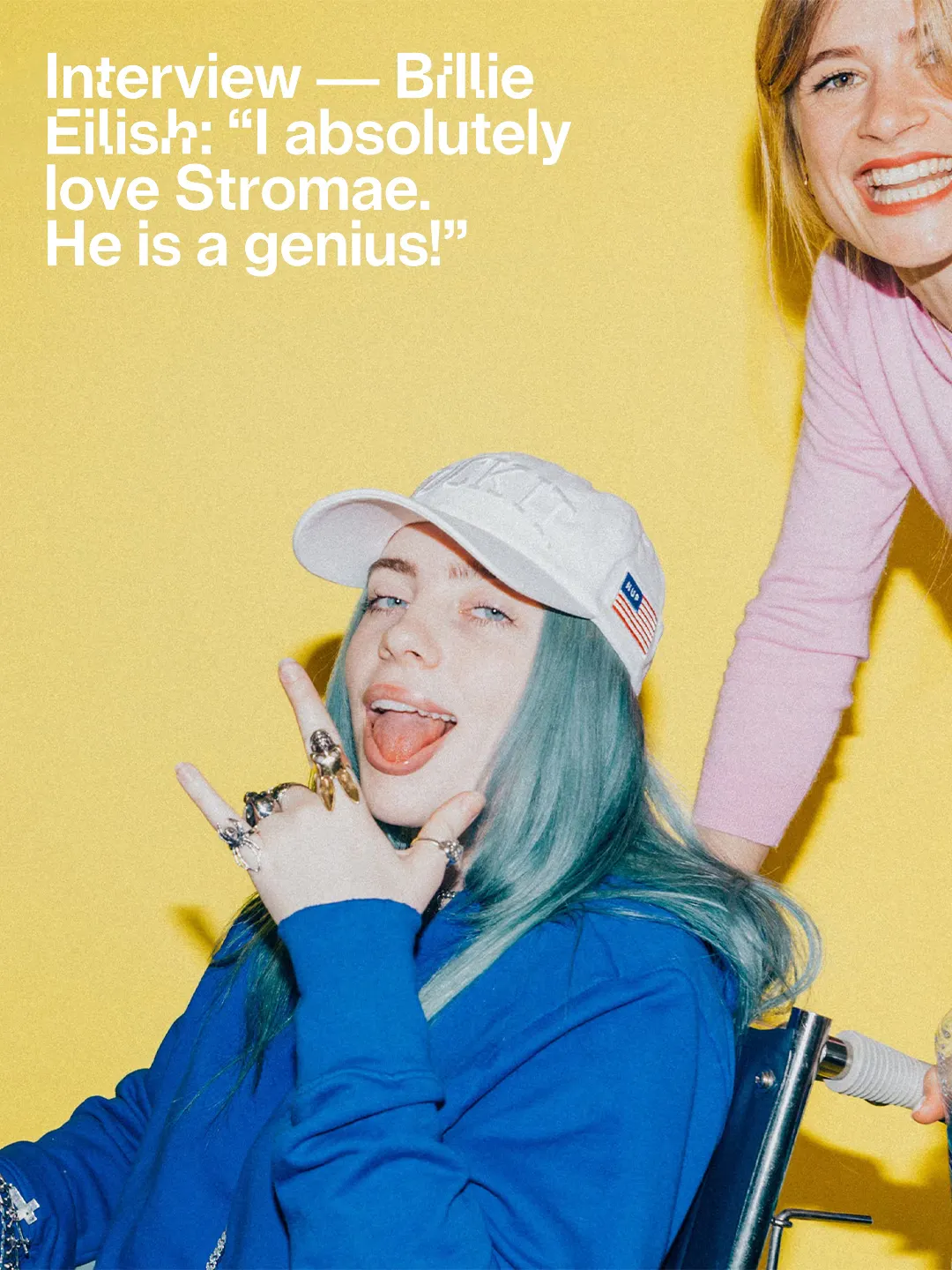
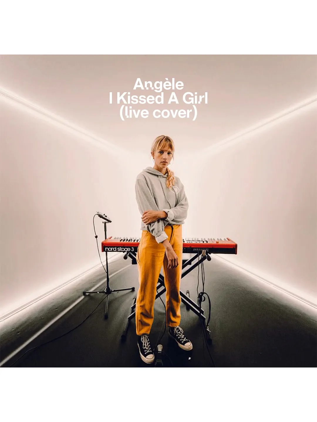
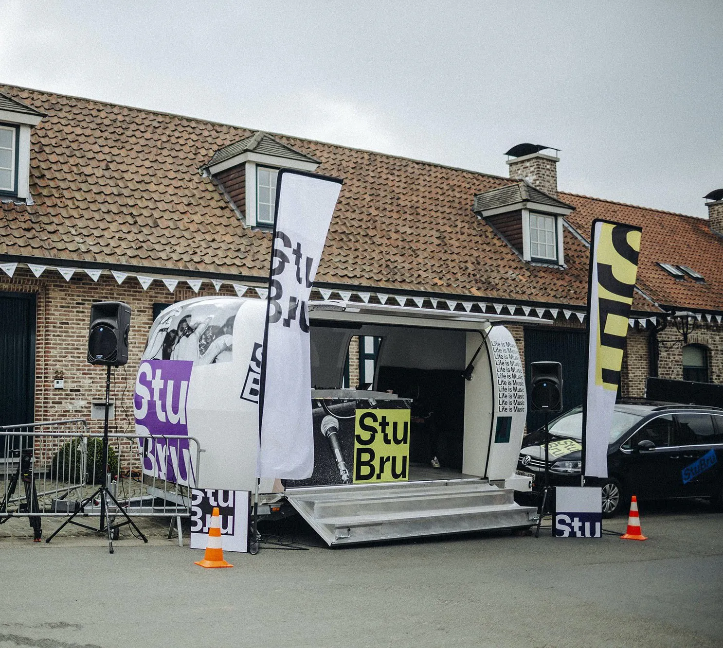
Most Belgians already referred to the station as StuBru, so it felt natural to use this shorthand to steer the new identity (many didn’t even notice the name change). A glitchy custom typeface was developed to symbolize a disruptive attitude and introduce letters with a sense of rhythm. Paired with sharp imagery that used flash photography to create a “caught in the moment” look, this gave a visual voice to the music.
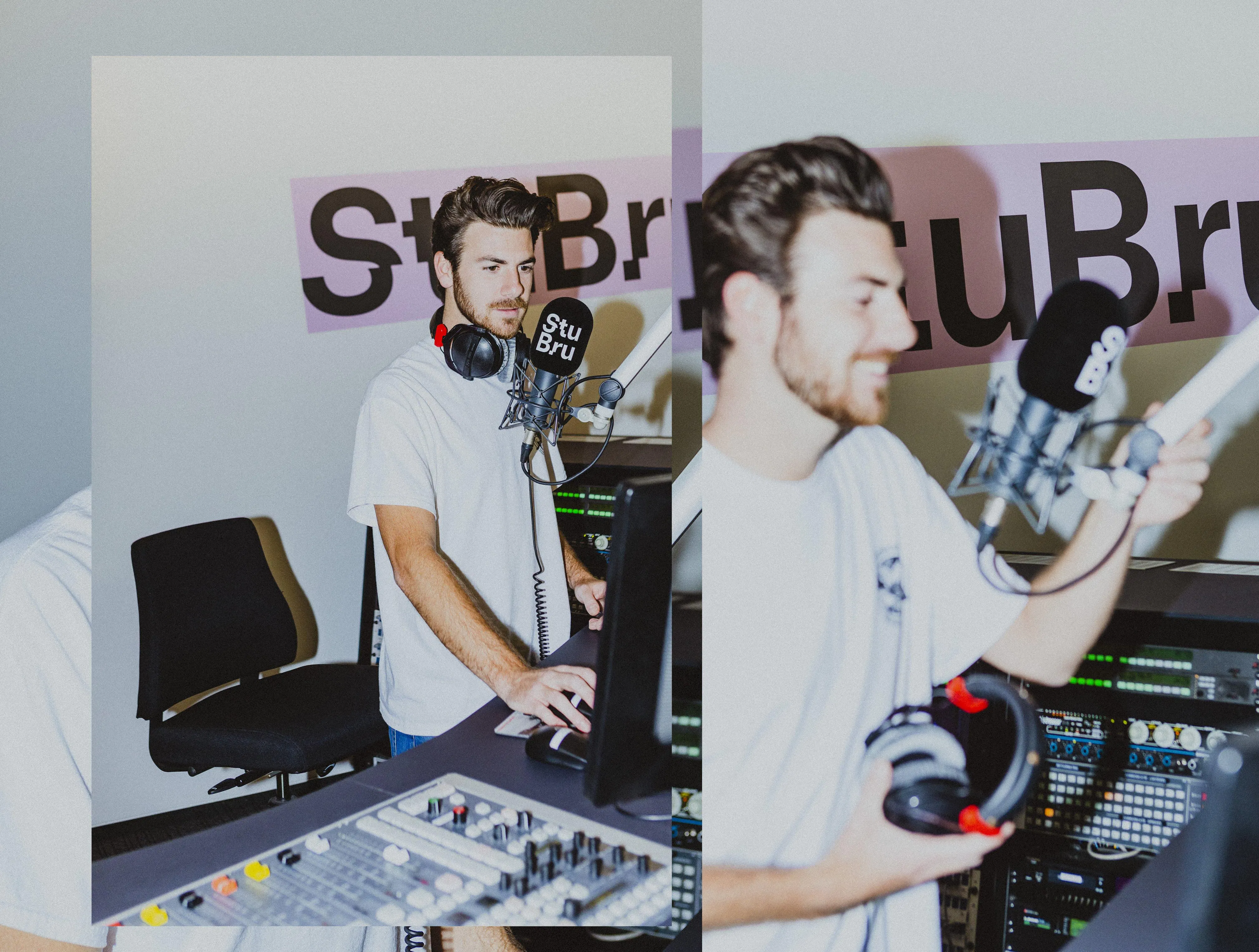
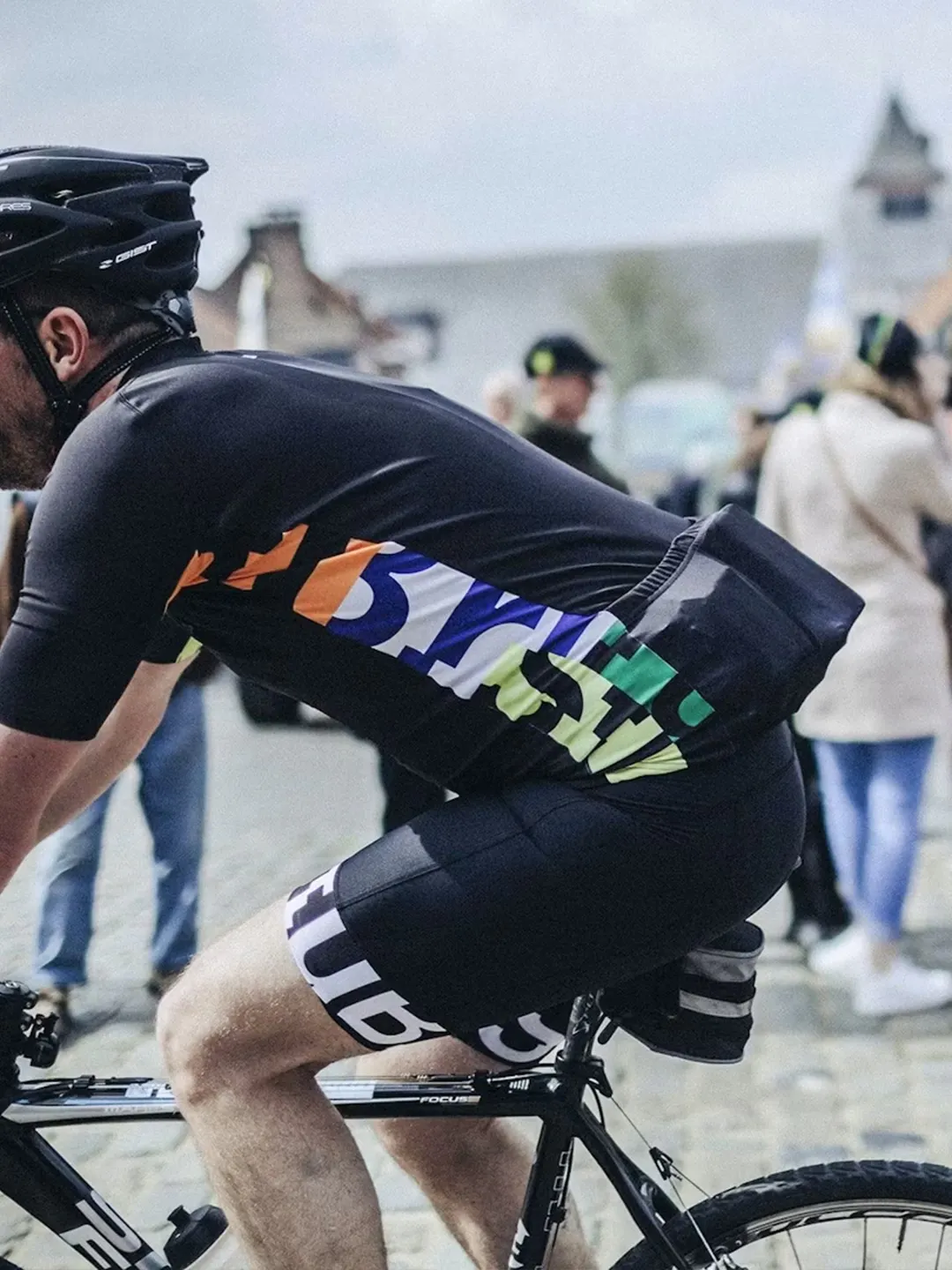
We updated the graphic layer of the website and visually clarified the navigation structure, creating an improved digital tool for audience growth. The new identity was also applied to physical environments, including the signage and mics at the StuBru studios. Its flexibility also made it perfect for announcing concerts and festivals, branding shirts for its bicycle racing team, and adorning merchandise.
The connection with youth culture firmly reestablished, Belgium’s greatest radio station was again able to rule the airwaves, represent the ideals of its listeners, and engage daily with its community as a leader in the music sector for the whole country. Mic drop.
Once a driving force for Belgian youth culture, Studio Brussel had lost its edge. We helped the radio station reclaim its position as a leader in the country’s music sector through an identity and a typeface that assigns a visual voice to the sounds of a new generation. This rejuvenation began inside the company, and expanded to capture a fresh audience by way of engaging content that we brought alive through digital tools.
In the age of downloads and streaming services, radio still plays a vital role in discovering new musical talents, curating a sound of the moment, and forming communities of listeners. Studio Brussel – a popular Dutch-speaking radio station in Belgium – has done just that since it was founded in the 1980s. Through several genre shifts, visual campaigns and reinventions – just like the artists it supports – the station has continued to set trends and capture the zeitgeist.
Although it maintained a vivacious and youthful energy, Studio Brussel had lost its edge and become increasingly mainstream. The leadership decided to revamp the brand identity to revisit its Rock’n’Roll roots, reclaim the gritty spirit, and reconnect with its fan base of young people. Keeping its essence while igniting a shift in programming and content creation, we were able to rejuvenate the radio channel while reconnecting to its position as the major reference for music culture in Belgium.
This shift began inside the national broadcast company, involving the producers and hosts in the brand expression. The next step was to put music back at the forefront of content and visuals, in order to impact a new generation of listeners. Studio Brussel never took itself too seriously, so channeled its diversity and spontaneity into a more conscious brand vocabulary.
Most Belgians already referred to the station as StuBru, so it felt natural to use this shorthand to steer the new identity (many didn’t even notice the name change). A glitchy custom typeface was developed to symbolize a disruptive attitude and introduce letters with a sense of rhythm. Paired with sharp imagery that used flash photography to create a “caught in the moment” look, this gave a visual voice to the music.
We updated the graphic layer of the website and visually clarified the navigation structure, creating an improved digital tool for audience growth. The new identity was also applied to physical environments, including the signage and mics at the StuBru studios. Its flexibility also made it perfect for announcing concerts and festivals, branding shirts for its bicycle racing team, and adorning merchandise.
The connection with youth culture firmly reestablished, Belgium’s greatest radio station was again able to rule the airwaves, represent the ideals of its listeners, and engage daily with its community as a leader in the music sector for the whole country. Mic drop.
{kind=image}
{kind=image}
{kind=image}
{kind=image}
{kind=image}
{kind=image}
{kind=image}
{kind=image}
{kind=image}
{kind=image}
{kind=image}
- Creative DirectionThomas Leon
- DesignSander Vermeulen
- Digital Design & DevelopmentDelphine Volkaert, Louis Hoebregts, Pierre Stoffe, Maxime Palau
{kind=image}
{kind=image}
{kind=image}