{kind=image}
Terminal 4 at JFKHigh Flying
Forever changing the tropes of the aviation industry
A favored airline hub, a desirable business location, and an enjoyable passenger destination – T4 at JFK has to tick many boxes. By unconventionally treating the airport terminal as a brand, Base was able to encompass all of the above, while enlivening its concourses with humor, whimsy and joy to create a travel experience that’s memorable for all the right reasons.
Let’s face it, no one wants to spend time in an airport. But despite being the largest terminal both at New York’s John F. Kennedy International and in the United States, T4 is far from an impersonal, overwhelming and frustrating travel hub. Instead it’s a place of warmth, humanity and humor. This subversion has broken all conventions of bland and neutral American airports, and changed the vernacular of aviation – as a destination that passengers, retailers and airlines actually want to find or locate themselves in.
Airport terminals are not typically branded, so the initial decision to give T4 a distinct personality was bold. The T4 team realized that by applying a brand, they could conjure positive emotions in visitors during their departures and arrivals processes. This lured businesses that saw benefits of operating in a terminal that travellers, and therefore customers, preferred.
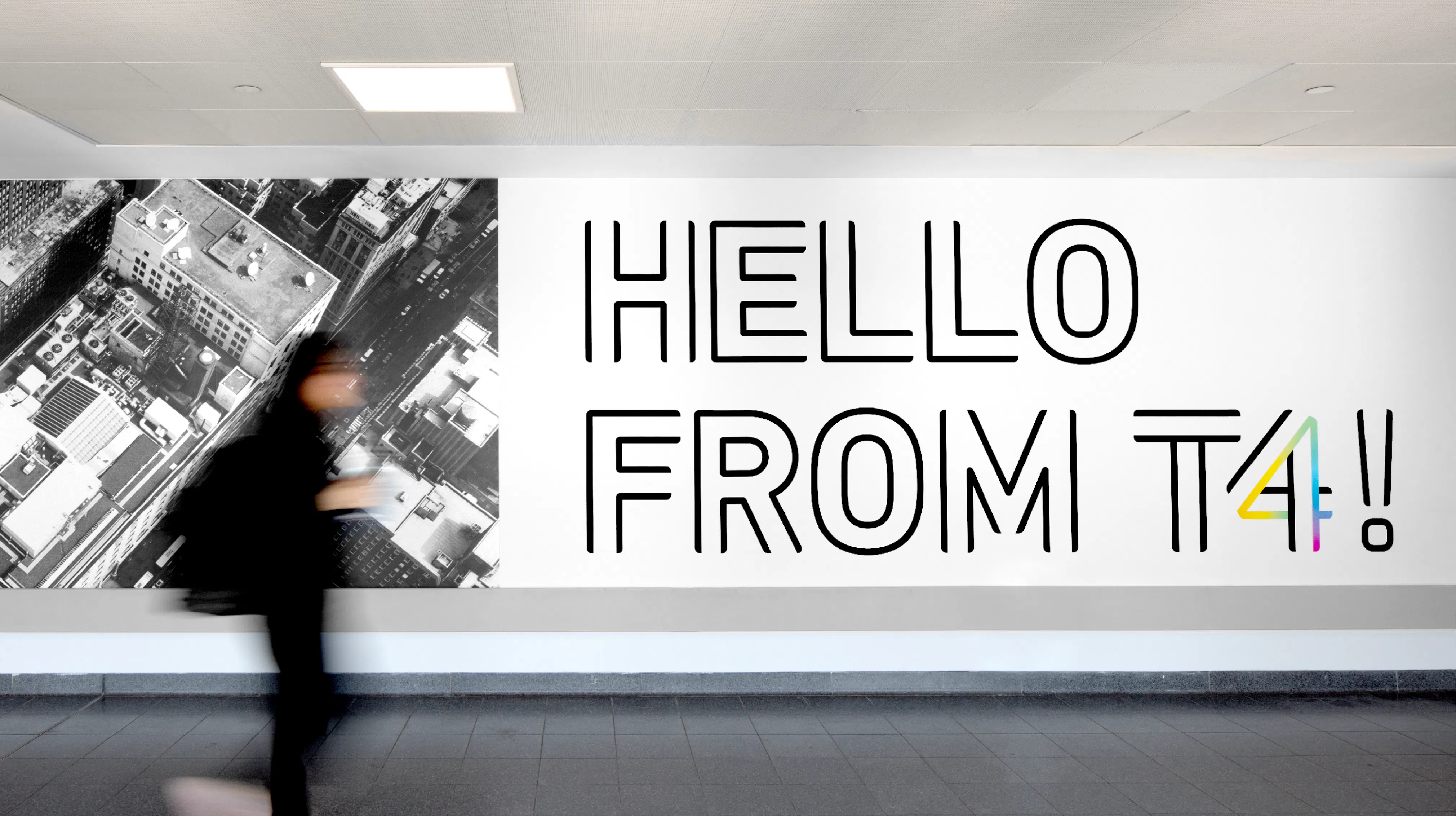
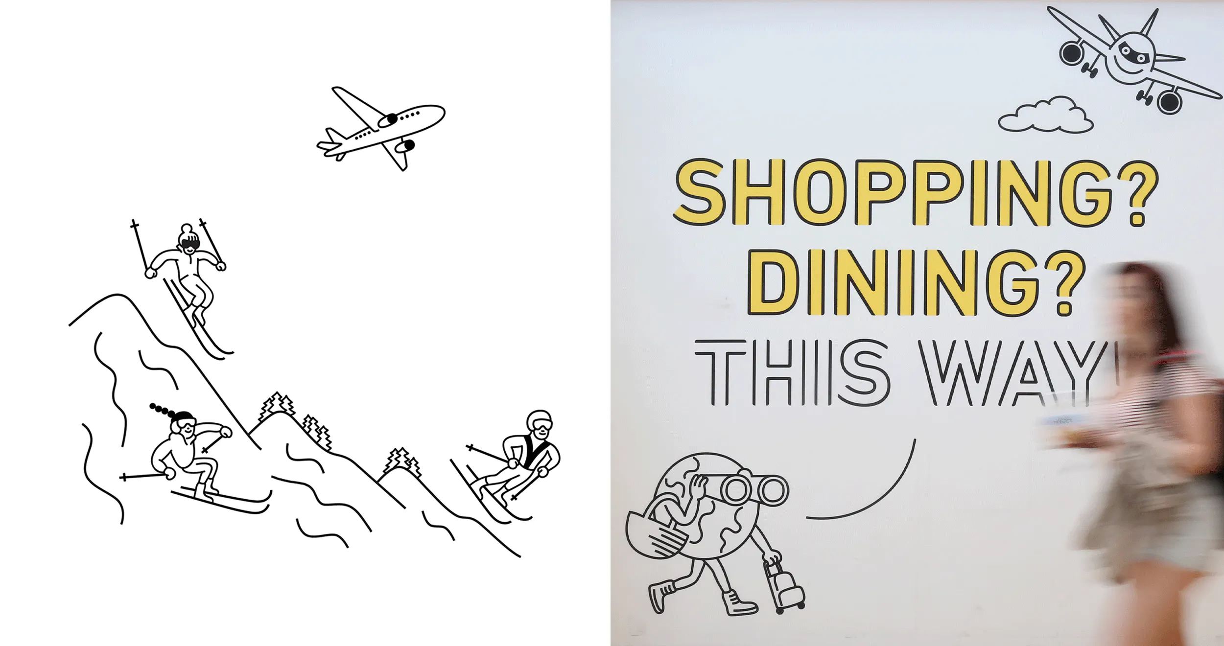
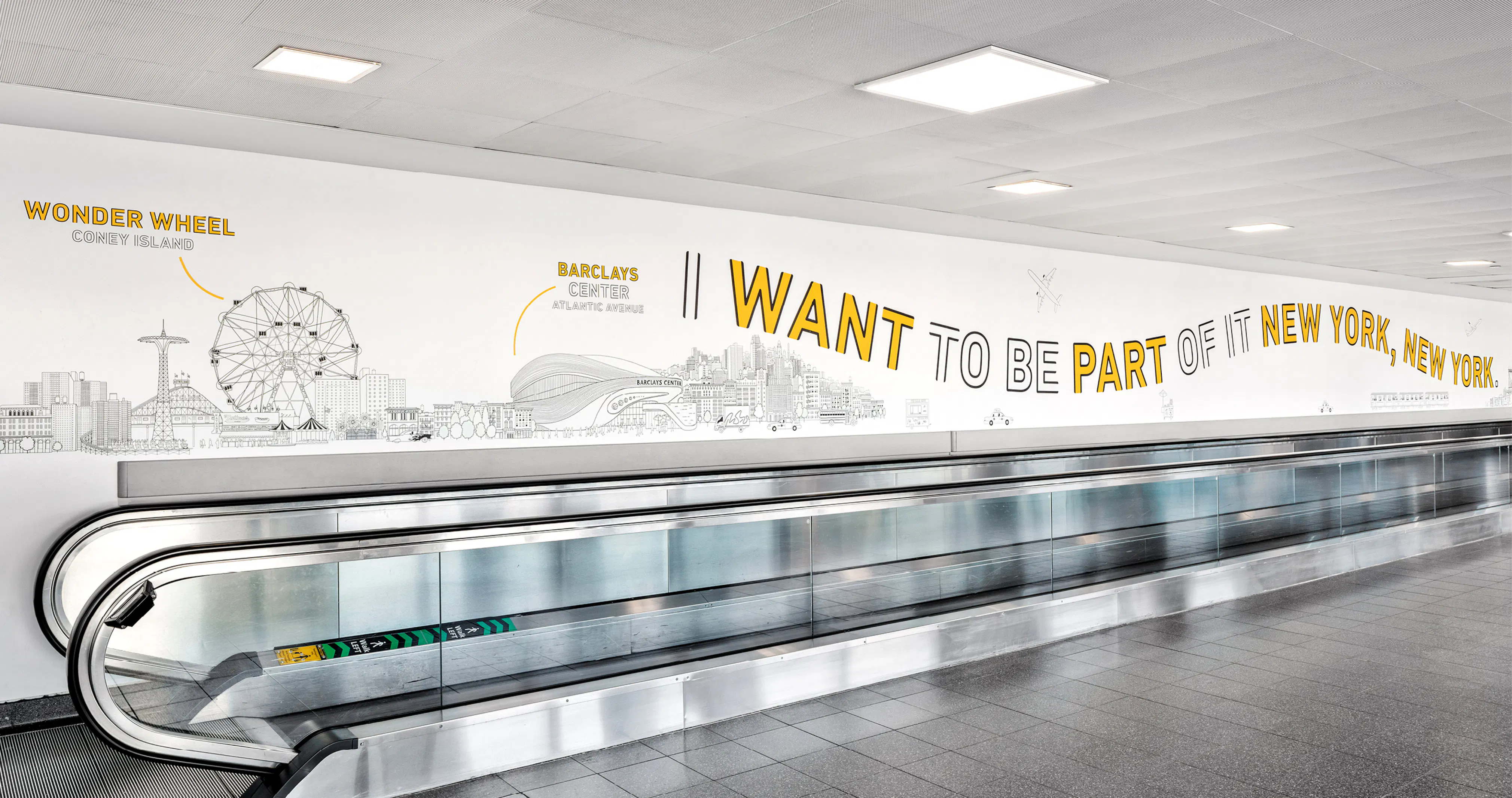
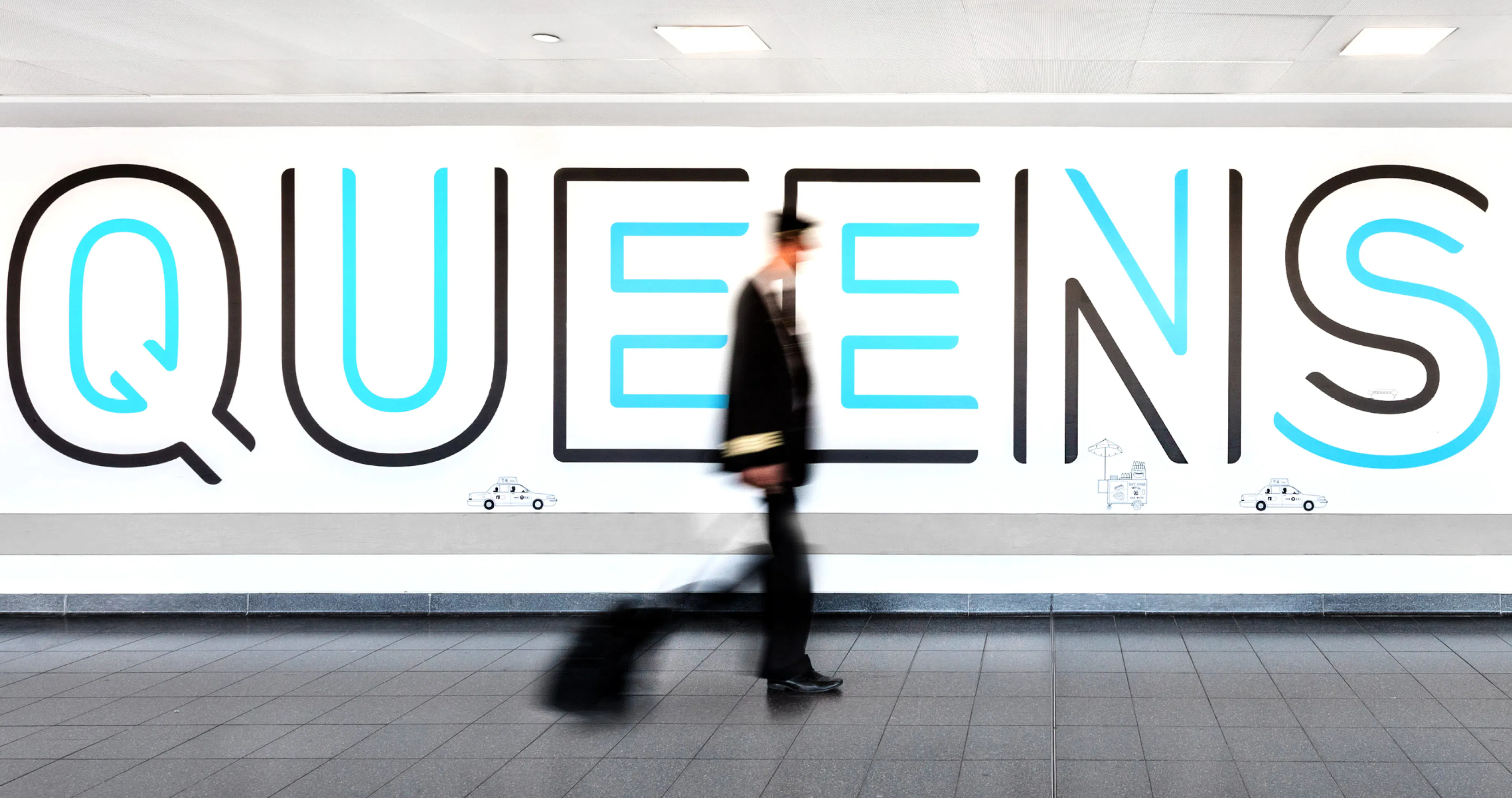
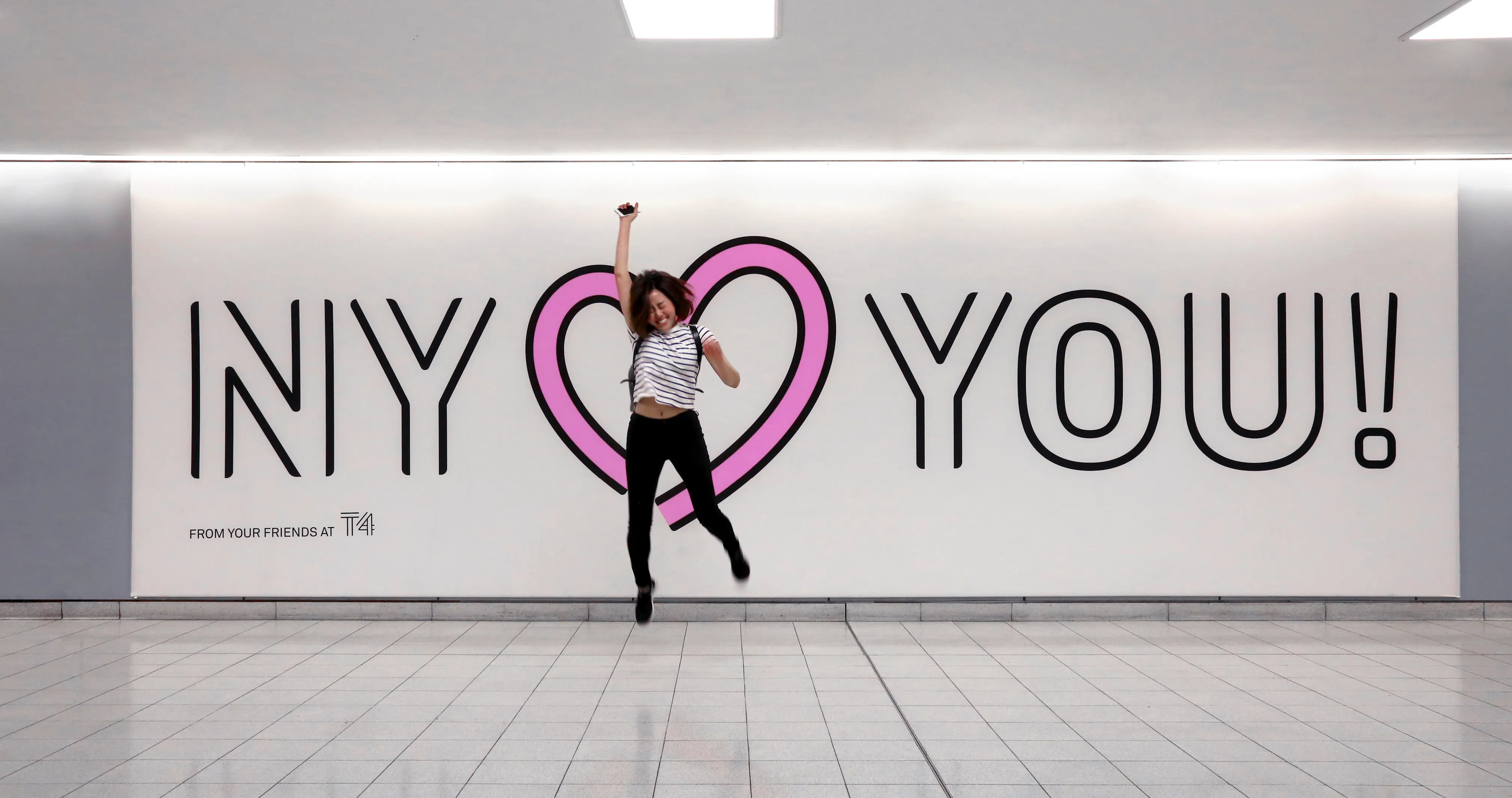
In developing T4’s personality, we looked to its team’s customer service mantra, “Don’t worry, be happy,” as a starting point. With this duality in mind, we created a visual identity designed to “Guide and Delight” passengers through more than a mile of jet bridges, corridors, and concourses. These spaces became a canvas for supersized environmental graphics that provide a constant reminder of the warm and generous ethos behind the brand. The illustrations draw on the best of New York City, representing its people, places and culture on an international stage.
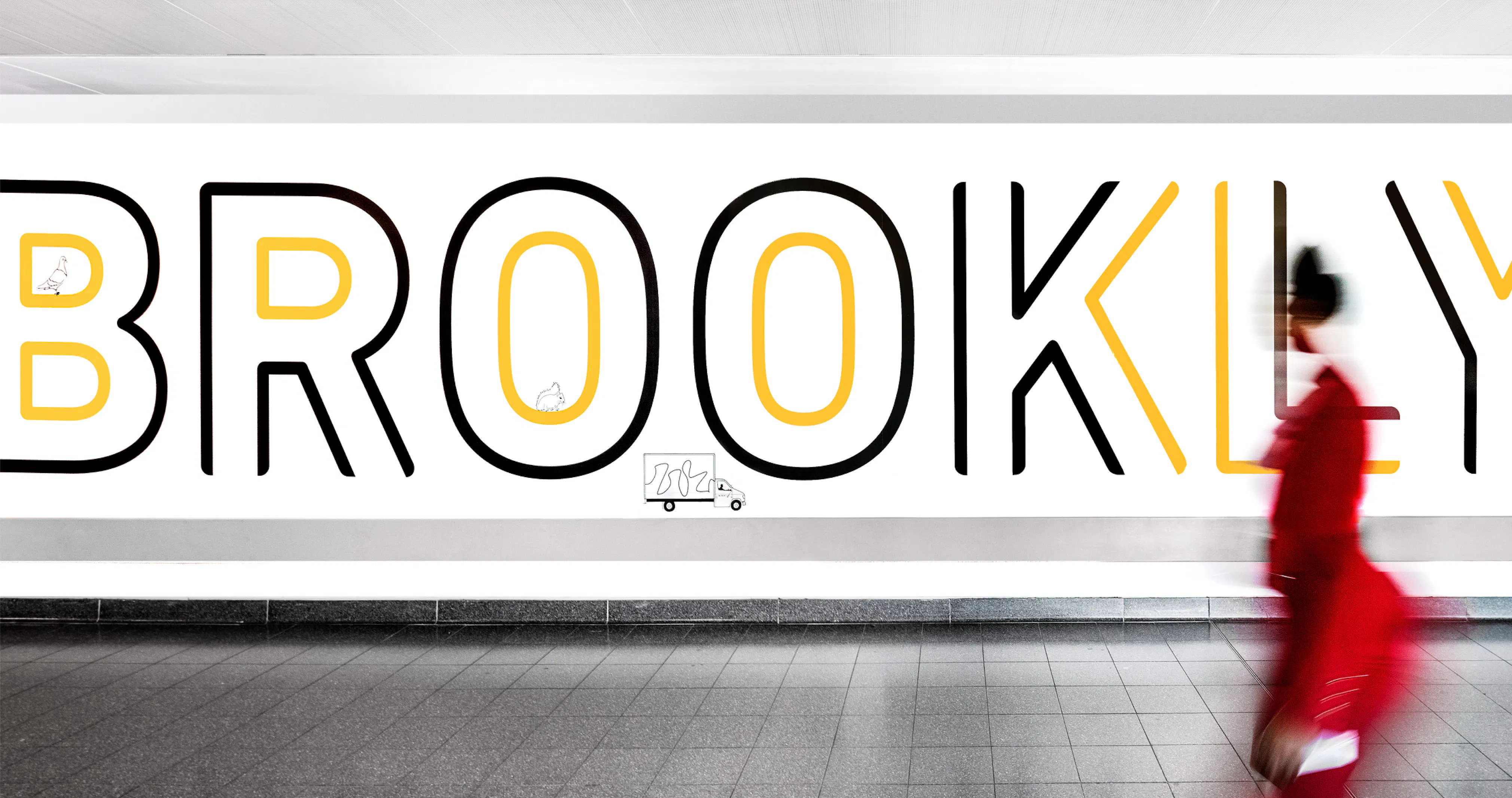
A custom typeface, which is now instantly recognizable, was also developed for T4 – applied across signage to help travelers navigate the vast terminal, and splashed boldly onto the walls to spell out famous quotes about the benefits of travel. Evocative of tarmac runways and airplane jet streams, the type appears friendly and not too corporate, while the messaging tone is friendly, fun, and builds excitement for those preparing to fly.
The overall result is a terminal experience that has become a pleasant, rather than dreaded, part of traveling for all. Even after several years, the “Welcome to NYC” sign that greets arrivals still puts a smile on the faces of visitors and residents alike. It’s hard to think of another airport that has the same positive effect.
A favored airline hub, a desirable business location, and an enjoyable passenger destination – T4 at JFK has to tick many boxes. By unconventionally treating the airport terminal as a brand, Base was able to encompass all of the above, while enlivening its concourses with humor, whimsy and joy to create a travel experience that’s memorable for all the right reasons.
Let’s face it, no one wants to spend time in an airport. But despite being the largest terminal both at New York’s John F. Kennedy International and in the United States, T4 is far from an impersonal, overwhelming and frustrating travel hub. Instead it’s a place of warmth, humanity and humor. This subversion has broken all conventions of bland and neutral American airports, and changed the vernacular of aviation – as a destination that passengers, retailers and airlines actually want to find or locate themselves in.
Airport terminals are not typically branded, so the initial decision to give T4 a distinct personality was bold. The T4 team realized that by applying a brand, they could conjure positive emotions in visitors during their departures and arrivals processes. This lured businesses that saw benefits of operating in a terminal that travellers, and therefore customers, preferred.
In developing T4’s personality, we looked to its team’s customer service mantra, “Don’t worry, be happy,” as a starting point. With this duality in mind, we created a visual identity designed to “Guide and Delight” passengers through more than a mile of jet bridges, corridors, and concourses. These spaces became a canvas for supersized environmental graphics that provide a constant reminder of the warm and generous ethos behind the brand. The illustrations draw on the best of New York City, representing its people, places and culture on an international stage.
A custom typeface, which is now instantly recognizable, was also developed for T4 – applied across signage to help travelers navigate the vast terminal, and splashed boldly onto the walls to spell out famous quotes about the benefits of travel. Evocative of tarmac runways and airplane jet streams, the type appears friendly and not too corporate, while the messaging tone is friendly, fun, and builds excitement for those preparing to fly.
The overall result is a terminal experience that has become a pleasant, rather than dreaded, part of traveling for all. Even after several years, the “Welcome to NYC” sign that greets arrivals still puts a smile on the faces of visitors and residents alike. It’s hard to think of another airport that has the same positive effect.
{kind=image}
{kind=image}
{kind=image}
{kind=image}
{kind=image}
{kind=image}
{kind=image}
{kind=image}
- Creative DirectionMin Lew
- DesignDaniel Peterson, Inva Cota, Arno Baudin, Joseph Grigola, Wael Morcos, Ian Nam, Bo Peng, Gina Shin, Ethan Sung
- Project ManagementJake Post
- IllustrationTomi Um, Chris Dent
{kind=image}
{kind=image}
{kind=image}