He’s Our Type (Designer): Matthieu Cortat-Roller
Laser letterforms! It’s party time at BaseWindow in Geneva, where Swiss typographer Matthieu Cortat-Roller – who has worked on a variety of typefaces for Base (including the one you’re reading now) – has programmed a laser to project 15 different alphabets that he has designed. We asked him to tell us all about it.
Hi Matthieu! Please introduce yourself and tell us about your background.
I was born in Switzerland and I studied graphic design at ECAL in Lausanne. When I did an MA in type design in Nancy, France, I met a nice girl and moved with her to Lyon, where I still live and she's my now wife. I’ve worked for some time in the Lyon Museum of Printing and Graphic Communication. And for the last six years, I've been the Head of the Masters in type design at ECAL. Both of these are part-time jobs. And the other part, I create fonts for retail that are distributed by the type foundry 205TF, as well as custom projects. Quite a few of these have been with Base Design. I think first it was with the Geneva office, then more frequently with Brussels, and a few with New York.
How did you start working with Base, and how did that relationship develop?
I was in touch with the studio via Anthony Franklin, who was a former classmate of mine. Around the time that the Geneva studio joined the global Base group, they wanted to do something to celebrate. They created a website that allowed users to generate posters playing with the clichés about Switzerland, and they asked me to make a new version of the Helvetica typeface for this. Originally there was only one cut, which was a medium weight, but then I was free to develop the font that eventually became Basetica, which still exists today.
With the reshaping of the Base website and communications last year there was an idea floated to update the Basetica font. I started working on this with Anthony, and Sander Vermeulen from the Brussels office. The form shifted a lot from the original into something else. We had planned to name it New Basetica, but internally it became known as Base Grotesk. As with the first project, I was able to distribute the font myself and I named it Muoto, which is the Finnish word for “shape.”
You’ve also worked in close collaboration with Base on typography for several client projects over the years. What are some of the highlights of those jobs?
A big one was Caran d’Ache, the pen manufacturer, with Base Geneva. I don’t know about in the US, but if I say “Caran d’Ache” to anyone in Europe, they know what it is. Also the City of Lausanne. I had quite a lot of fun with the Los Angeles Master Chorale font. For this we had two versions: a kind of copy and paste of different voices, superimposed with a lot of optical corrections. In terms of visibility, there’s the font for Terminal 4 at JFK too. Looking through my archive folders, I have 29 projects with Base Brussels – some of which were not released – nine with Base Geneva, and 10 with Base New York.
What is it that you enjoy the most about working with Base?
I’ve worked with several different people at Base, and it’s very different from one to the other. Some of them no longer work at Base, but I still work with them now and again. The person I’ve worked with the most from Base is Sander, and with him it’s a very straightforward process. If he doesn’t like something, he won’t spend 10 minutes telling me, and I quite enjoy that.
Chatting with Tom Fethers on Slack, with whom I’m exchanging at the moment, is also a simple and informal process. Also, if someone from Base approaches me for a project and I think that it’s shitty, then I won’t be afraid to say it. And the opposite, if I make a sketch that really isn’t fitting what the design director has in mind, I’m informed quite early on. We’re not playing games. It’s great to be trusted, and to work closely together and discuss even the small details. It’s more interesting to work that way.
We’re very excited that you're opening an exhibition as part of the Base Window series at our Geneva office. Can you explain a bit about what that will entail?
We quickly agreed that it wouldn’t be interesting to simply show past work that we’ve done together, like a retrospective. So the idea was to create something new.
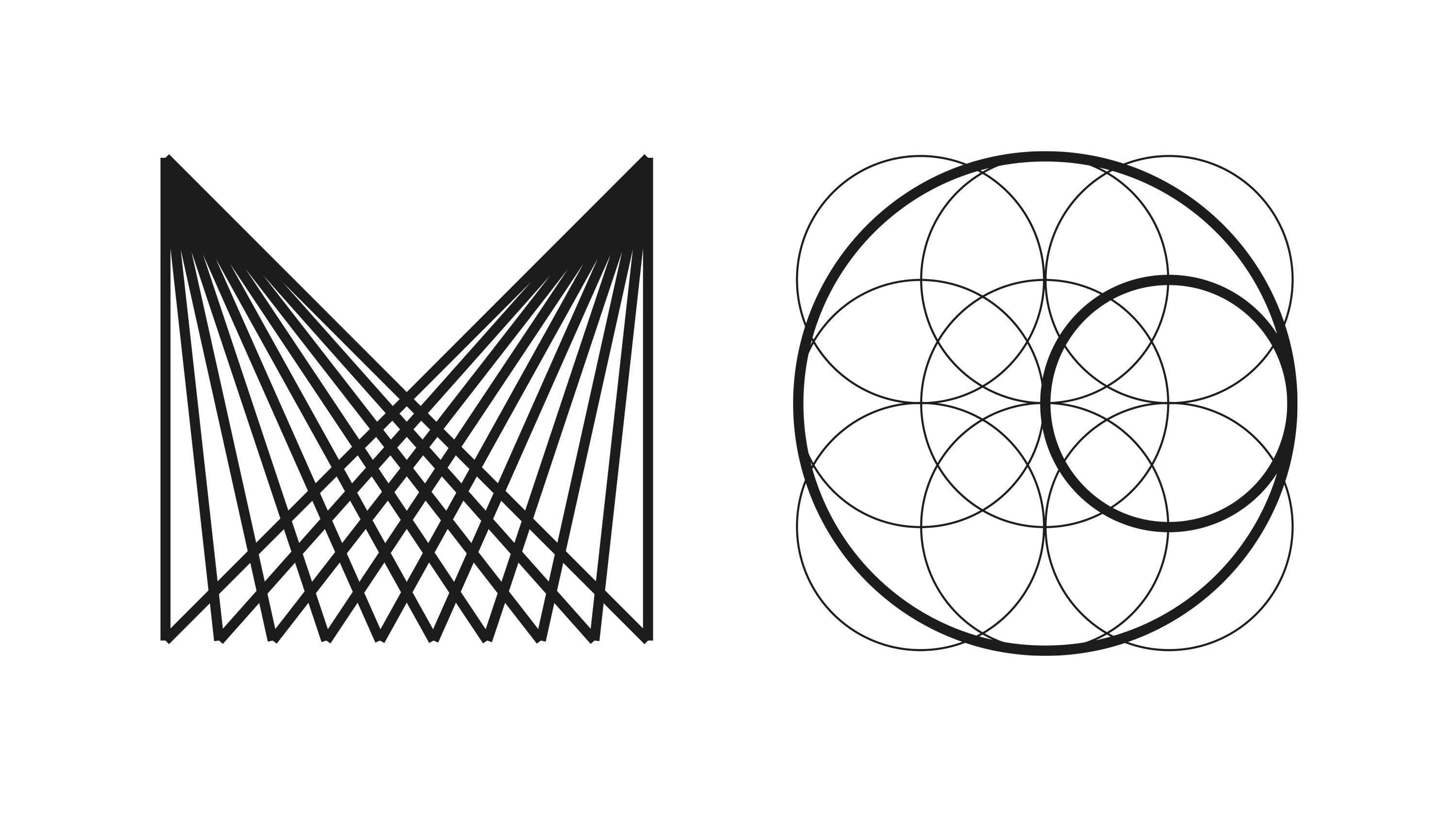
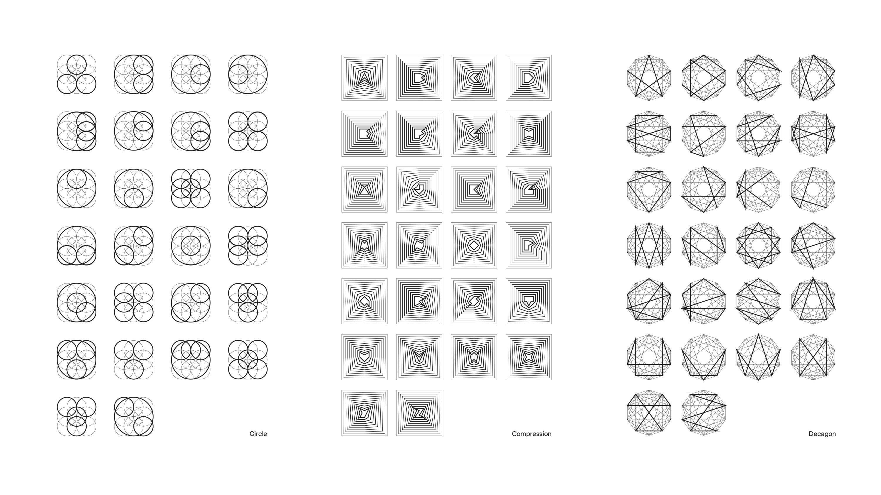
I was looking for something that would really make use of the space, since it's a gallery, and not just a book. So the aim was to do something in 3D, in volume, not pasting flat letters on the walls. Then the idea came of using the lasers, so I bought one and started to play with it. There was a lot of technical stuff that I had to figure out how to do. But basically I’ve programmed it to draw letterforms.
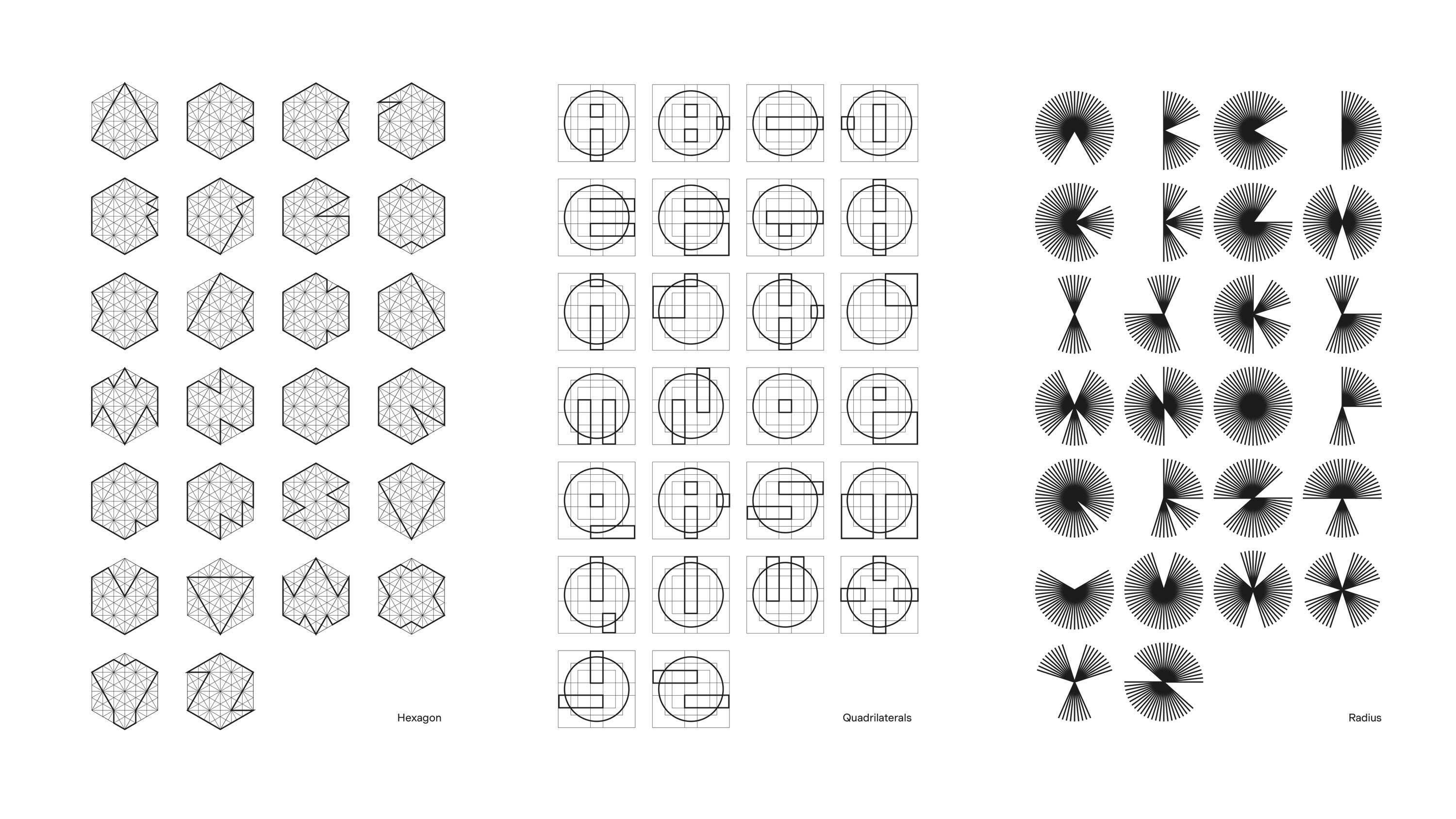
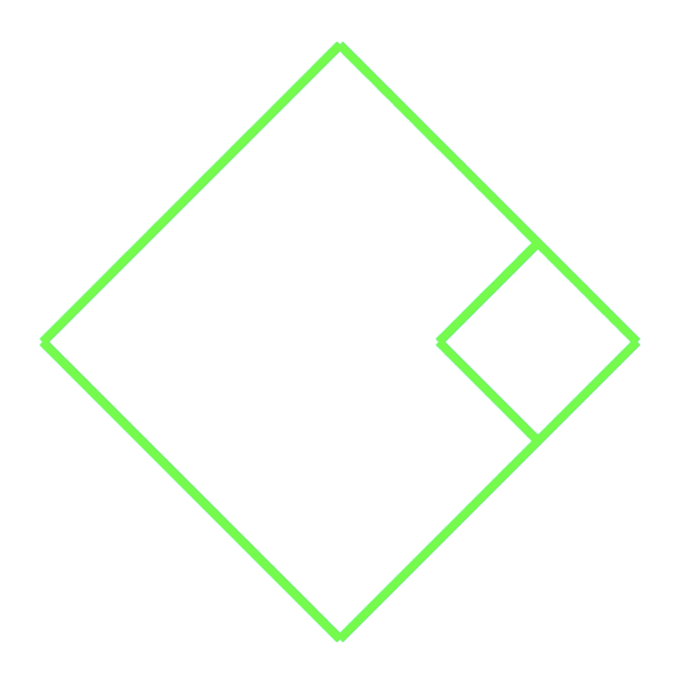
The laser comes with a lot of limitations. The shapes have to be very geometric to work physically. But you can add movement. So I’ve been working on how to make letter shapes using movement, and distill their distinguishable elements from when they are static. I've worked on 22 series, seven of which are just not too complicated or not possible, or didn't work for one reason or the other. So we ended up with 15 alphabets that each follow a series of constraints from A through to Z.
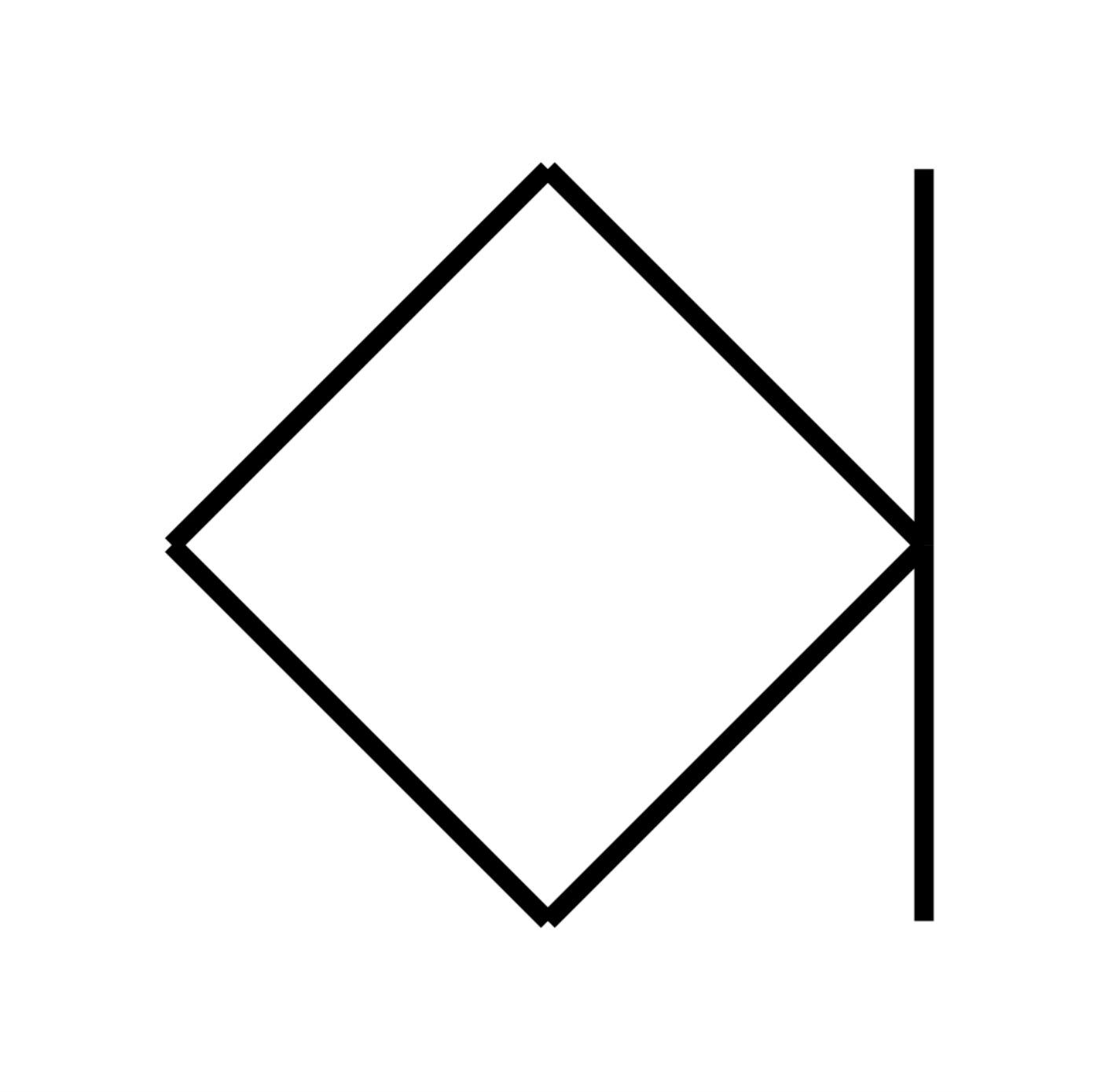
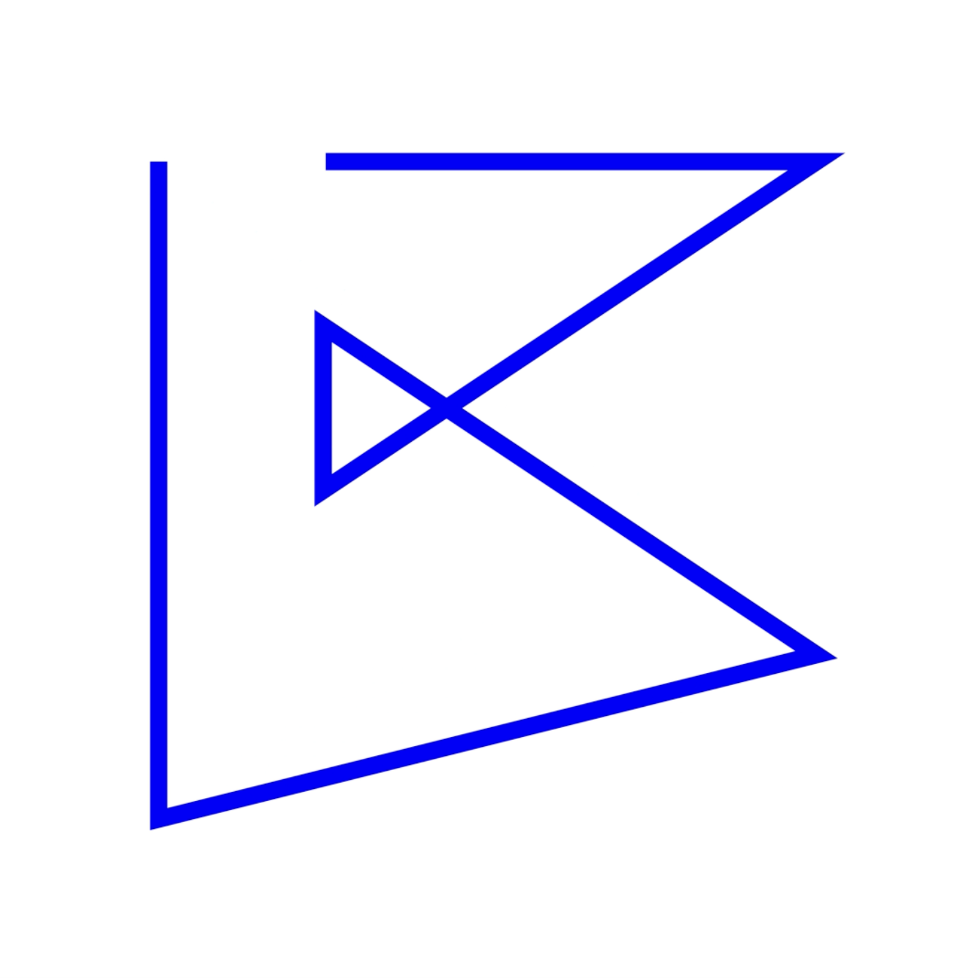
We read best what we read most. Letters are conventions, and as with other conventions, some of their elements are more important than others. For typographic conventions, context matters a lot. Once placed in alphabetical order, letters depend less on their design to be legible: you can tell which letter you’re reading, thanks to its position in the series. A triangle is not necessarily an ‘A’ anymore. It can be almost any other letter. And the ‘A’ can take the form of a circle, a square, a cube, a hexagon, or even a star. Anything can be a letter. You just have to trust your eyes and your imagination.
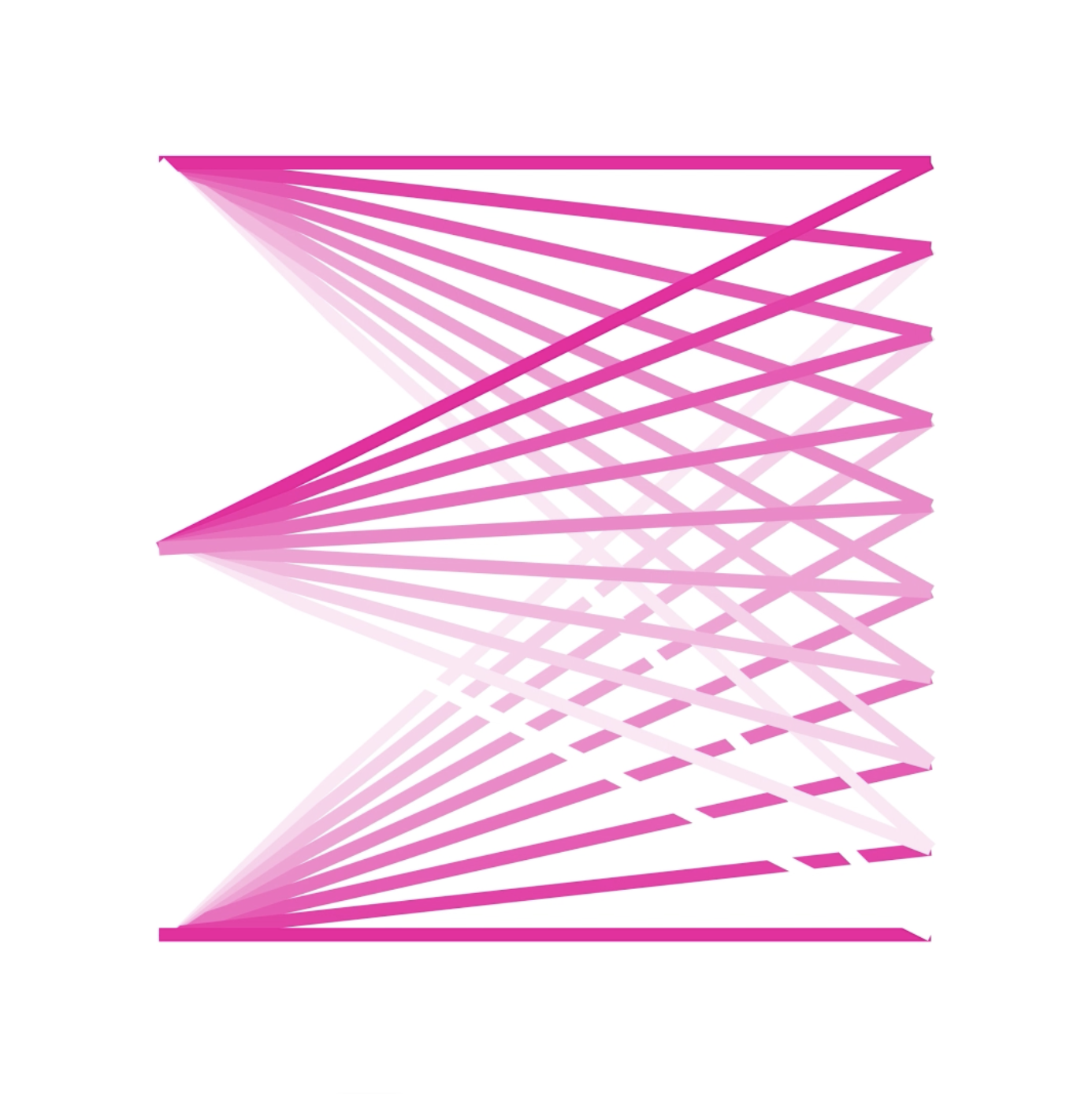
For instance, there is one series that constantly turns, and forms a letter when it reaches a certain position, sometimes based on a square, sometimes based on a lozenge. Some of the letters are not particularly legible on their own, in the context of the alphabet, you manage to read them. There’s one alphabet formed from a collapsing square, while another comprises two lines crossing each other to create the letters.
Is this the first time that lasers have been used to create typography in this way, to your knowledge?
I think there’s probably been some similar experiments. But real alphabets? I’m not sure. The software I’m using has built-in type functions, which are not made for this purpose. The difficulty is that the whole system is usually used for parties, and it's not made for precise work. Basically, if you have a shape with three vector points, it will make the connections rounder, so I had to cheat with the machine to make them straight.
And these will be displayed multicolored?
Yes! The idea was to utilize the laser’s capabilities and project the bright, strange colors. Sometimes the colors are brighter than others. I did think about doing something minimalist, but at a certain point we thought we might as well embrace the color. We’re also working on a printed version in black and white, that will accompany the exhibition.
How do you think people will react to the exhibition?
I’m really interested in engaging the people walking by on the street, to see if they will stop and start looking in, and try to figure out the forms. I think that's something I look forward to seeing.
Matthieu Cortat-Roller at BaseWindow opens October 21, 2022 at Rue de Monthoux 12, 1201 Geneva. Stop by if you’re in the neighborhood!
Text by Dan Howarth.