{kind=image}
BVNCollective Creativity
Systemic change via system thinking
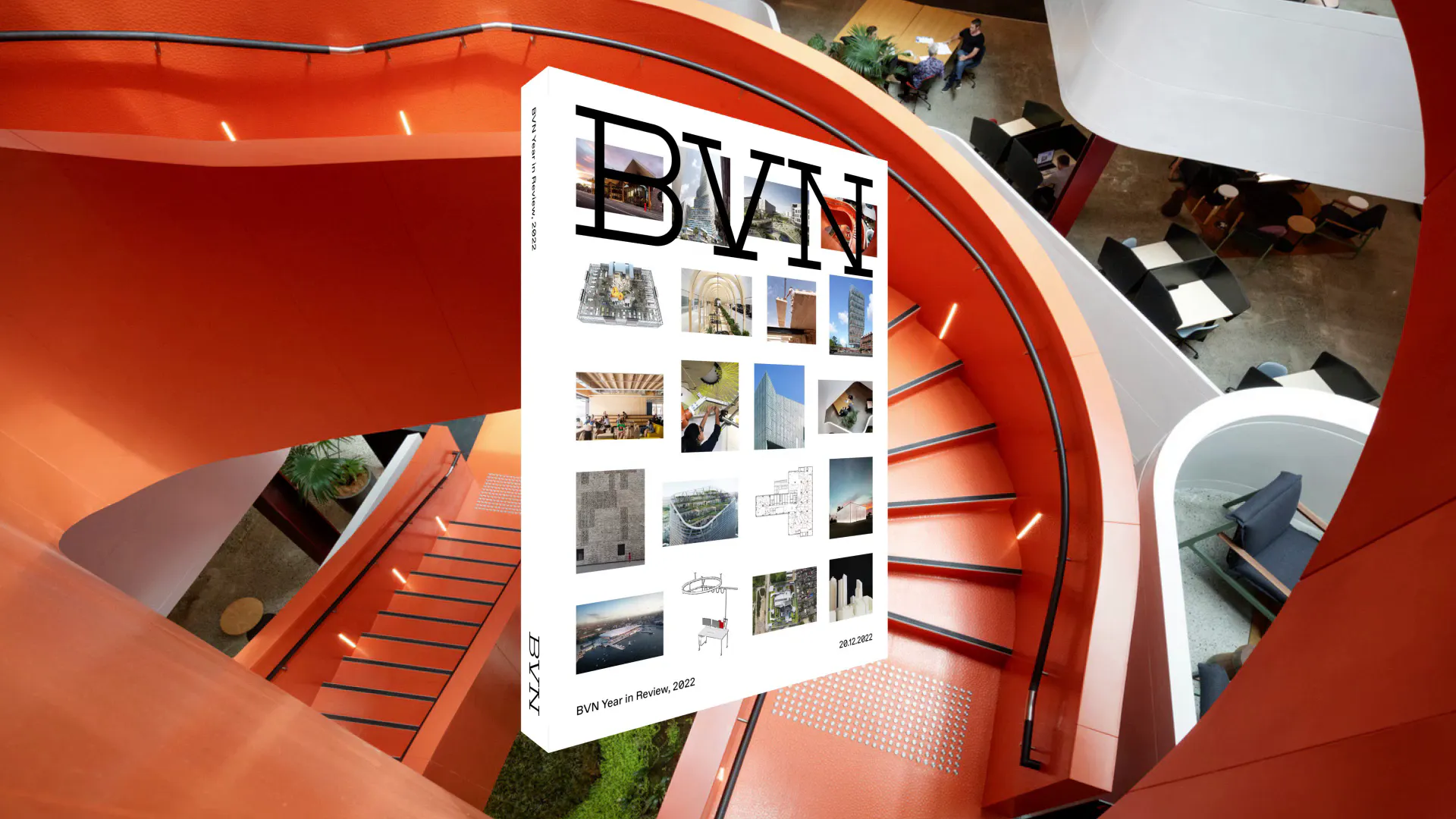
BVN is a creative collective of architects, designers, researchers and makers with offices in Sydney, Brisbane, London and New York. Connected by a shared vision for a better planet, passionate about problems and bold about solutions, they are simultaneously globally-minded and people-focused. It’s these ideas that underpin their new brand identity.
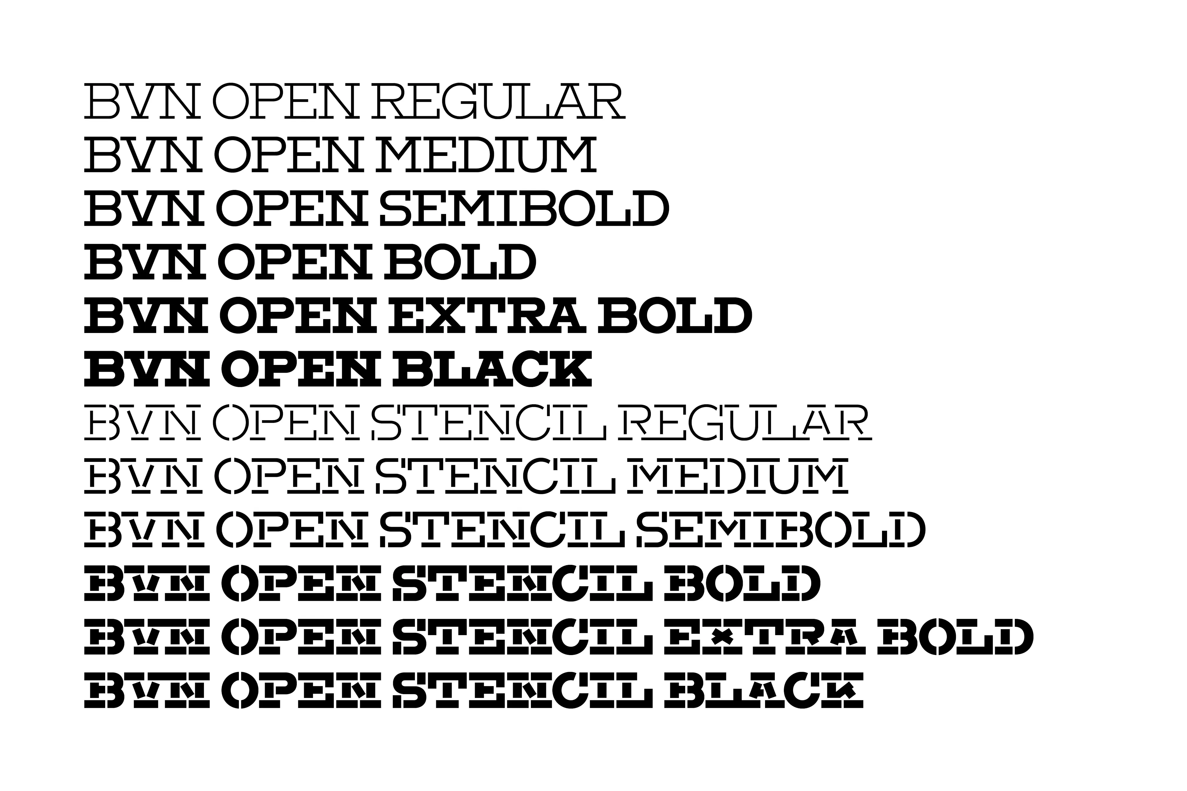
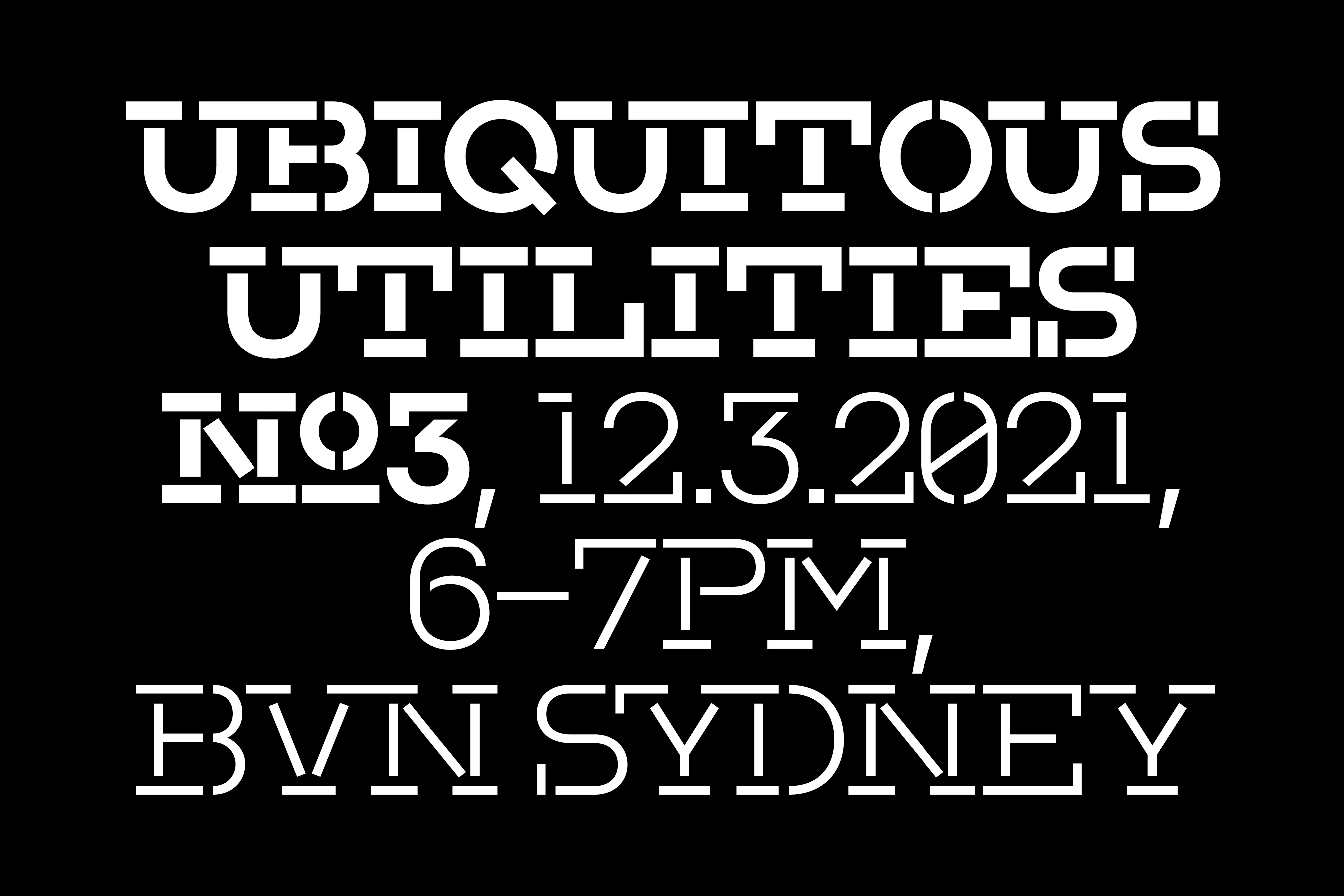
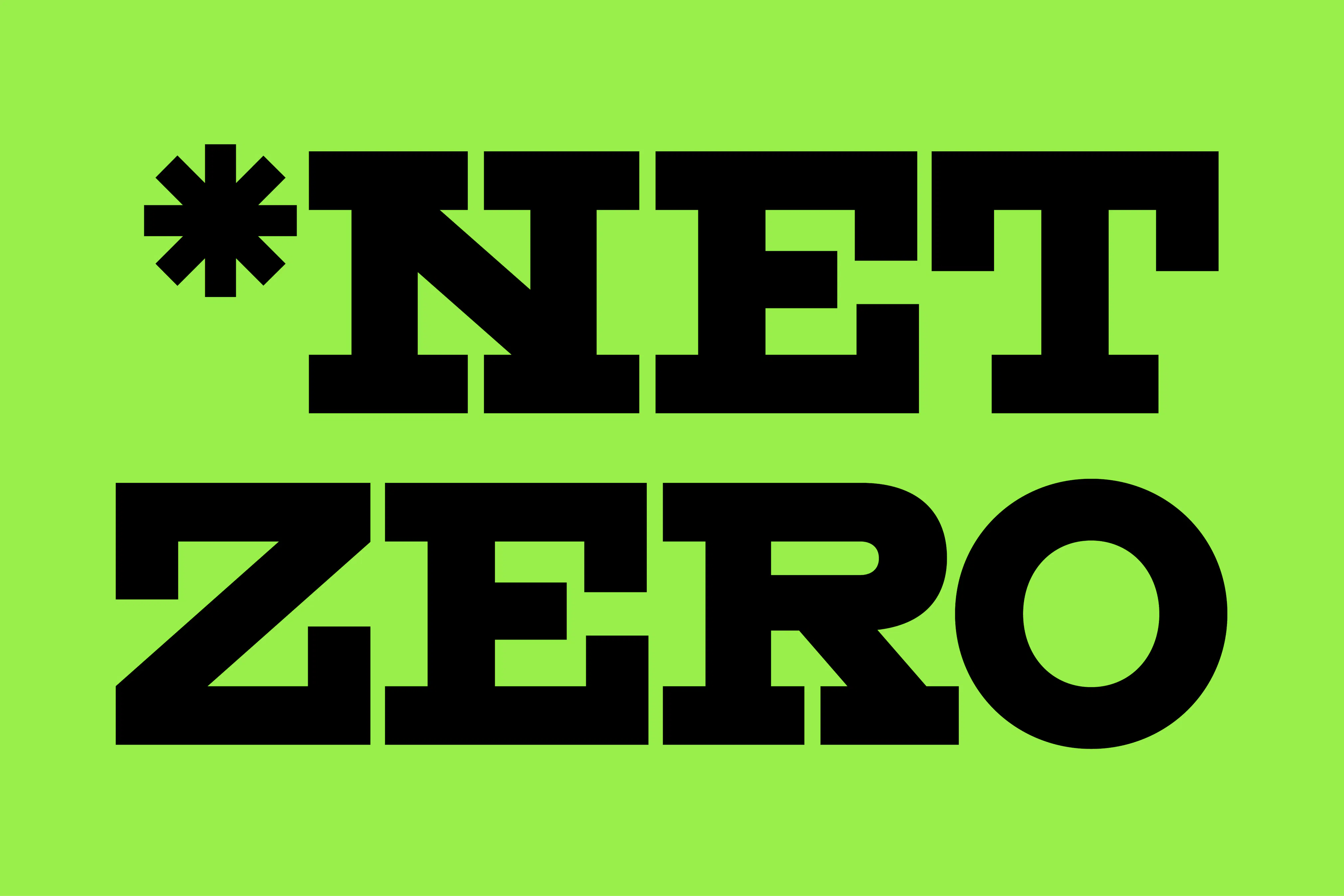
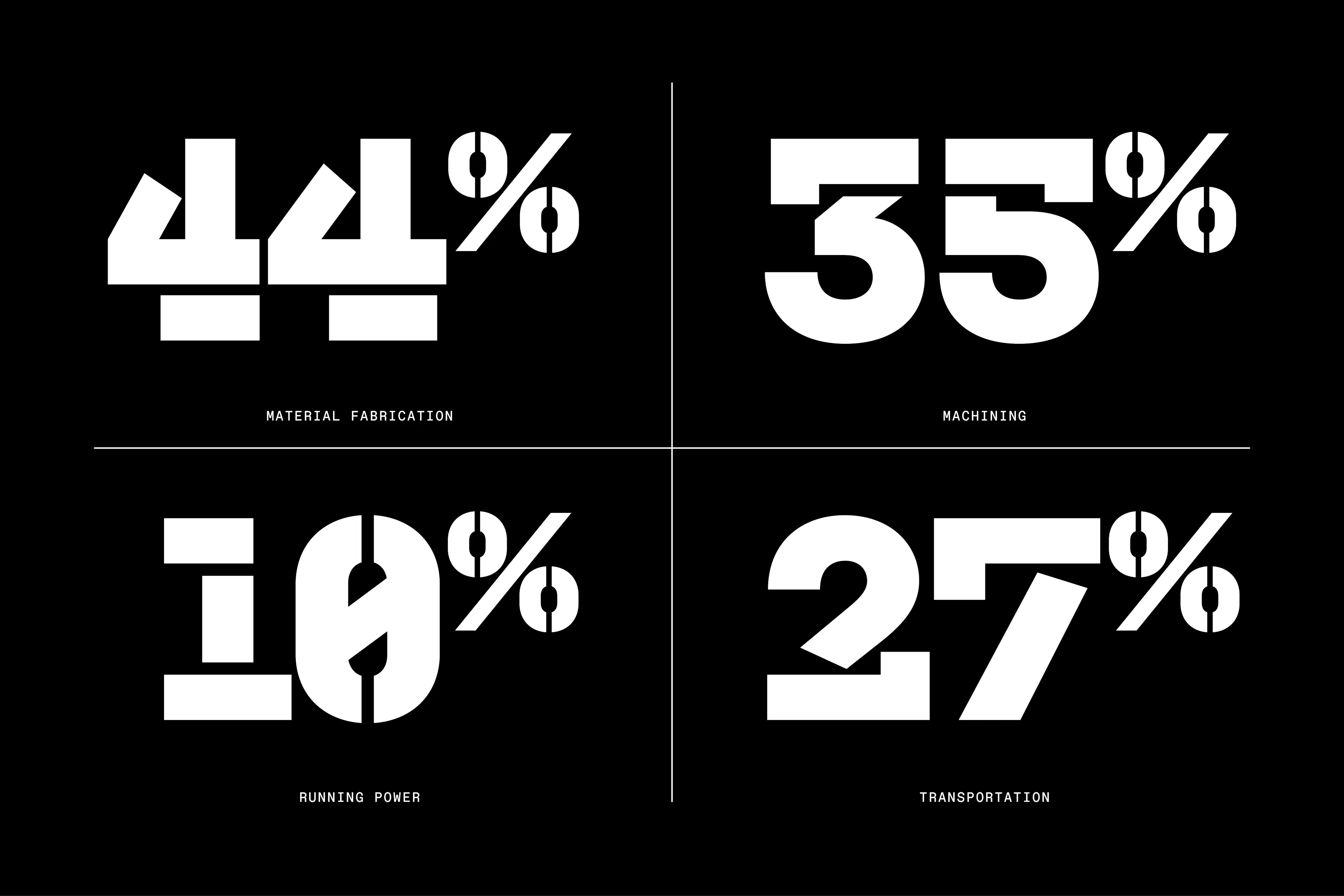
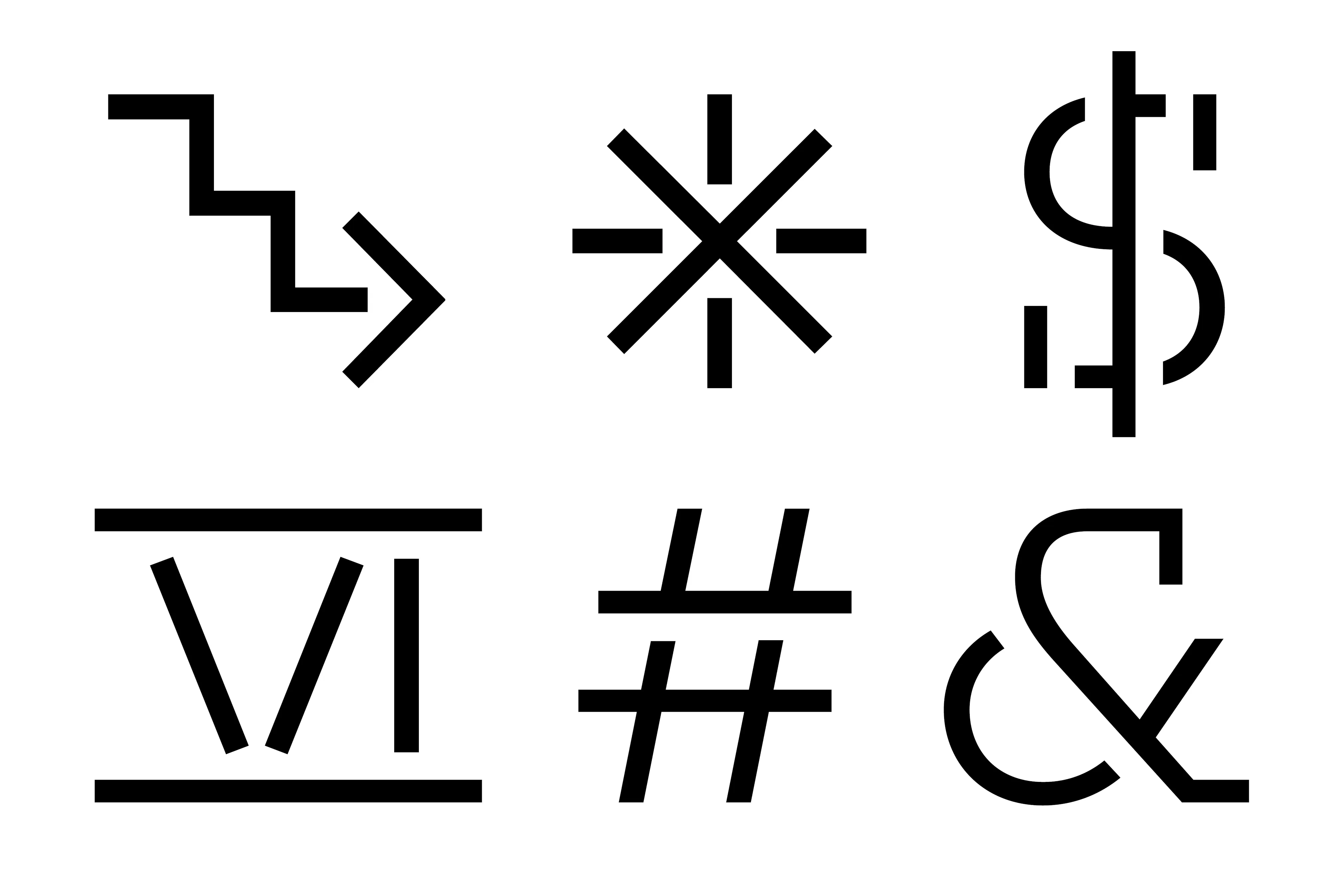
Using the logotype as point of departure we reimagined their new brand identity as an atom from which a comprehensive visual system evolved – from a custom variable typeface (developed in close collaboration with Vincent Chan), iconographic library, information graphics system, and beyond. All starting from the idea of an open box. This systems based approach provided BVN not just a powerful toolkit to showcase their work, but a means of celebrating work in process and speculative moonshot ideas, not just the final outcome. Thus solving a critical challenge when it comes to showcasing their large scale and complex work – that completed projects today were often designed 5+ years ago!
Architectural storytelling all too often considers other architects as the primary (or sole) audience. Not BVN. By employing a clearer and more conversational tone of voice, and showcasing projects didactically, BVN’s ninety plus years of experience is made accessible to the broadest possible audience. Welcoming the industry professional, prospective commissioner, student, or enthusiast equally.
Architecture as a profession is genuinely multi-authored, it’s also pretty messy and iterative (shaping the future always is). Collectively we chose to embrace these truths and showcase BVN’s work and internal culture honestly, from a documentary perspective. BVN as a practice operating in the world at large, and BVN under the hood. The result is a bright and exciting portrayal of practice as laboratory, and built environment as mise-en-scène.
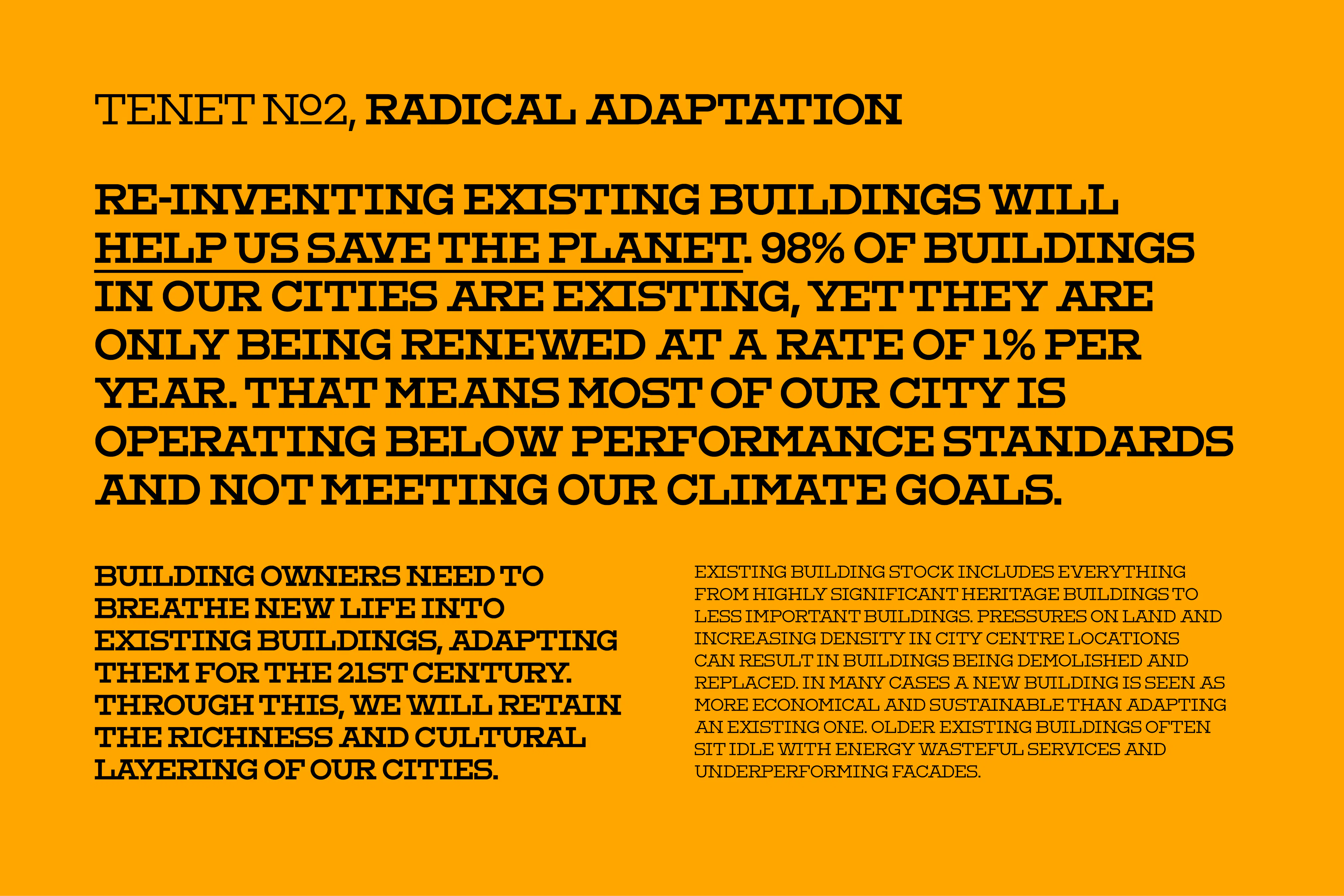
Bringing it all together is the BVN website, the culmination of almost 2 years working together. At its core are the tenets, a dynamic editorial presentation of BVNs core priorities, providing a deep understanding of their practice at a glance. Connecting projects to ideas not only creates unique ways to explore but it also ensuring audiences with limited architectural knowledge are respected and engaged. This consideration for the user is continued through the UI and UX, allowing users to dive deep into the site, but never get lost – rabbit holes with hand rails. BVN’s vast archive and myriad of ongoing projects are made more accessible than ever before.
BVN is a creative collective of architects, designers, researchers and makers with offices in Sydney, Brisbane, London and New York. Connected by a shared vision for a better planet, passionate about problems and bold about solutions, they are simultaneously globally-minded and people-focused. It’s these ideas that underpin their new brand identity.
Using the logotype as point of departure we reimagined their new brand identity as an atom from which a comprehensive visual system evolved – from a custom variable typeface (developed in close collaboration with Vincent Chan), iconographic library, information graphics system, and beyond. All starting from the idea of an open box. This systems based approach provided BVN not just a powerful toolkit to showcase their work, but a means of celebrating work in process and speculative moonshot ideas, not just the final outcome. Thus solving a critical challenge when it comes to showcasing their large scale and complex work – that completed projects today were often designed 5+ years ago!
Architectural storytelling all too often considers other architects as the primary (or sole) audience. Not BVN. By employing a clearer and more conversational tone of voice, and showcasing projects didactically, BVN’s ninety plus years of experience is made accessible to the broadest possible audience. Welcoming the industry professional, prospective commissioner, student, or enthusiast equally.
Architecture as a profession is genuinely multi-authored, it’s also pretty messy and iterative (shaping the future always is). Collectively we chose to embrace these truths and showcase BVN’s work and internal culture honestly, from a documentary perspective. BVN as a practice operating in the world at large, and BVN under the hood. The result is a bright and exciting portrayal of practice as laboratory, and built environment as mise-en-scène.
Bringing it all together is the BVN website, the culmination of almost 2 years working together. At its core are the tenets, a dynamic editorial presentation of BVNs core priorities, providing a deep understanding of their practice at a glance. Connecting projects to ideas not only creates unique ways to explore but it also ensuring audiences with limited architectural knowledge are respected and engaged. This consideration for the user is continued through the UI and UX, allowing users to dive deep into the site, but never get lost – rabbit holes with hand rails. BVN’s vast archive and myriad of ongoing projects are made more accessible than ever before.
{kind=image}
{kind=image}
{kind=image}
{kind=image}
{kind=image}
{kind=image}
{kind=image}
{kind=image}
{kind=image}
{kind=image}
{kind=image}
{kind=image}
{kind=image}
{kind=image}
{kind=image}
{kind=image}
{kind=image}
{kind=image}
{kind=image}
{kind=image}
{kind=image}
- Creative DirectionCaroline Cox, Daniel Peterson
- DesignCaroline Cox, Daniel Peterson, Owen Cramp
- Strategy & CopywritingDaniel Peterson
- DevelopmentThomas Tkatchenko
- Project ManagementJennifer Jones
- TypographyVincent Chan
- 2022 Designers Institute of New Zealand Best Design AwardsBronze Pin for Large Scale Websites
- 2022 Archiboo AwardsWinner for Best Visual Design
- 2022 AGDA AwardsMerit in Typefaces
- 2022 AGDA AwardsFinalist in Website Design
{kind=image}
{kind=image}