{kind=image}
DashPass by DoorDashYour Pass To More
More to see. More to try. More of more.
Context
Some services deliver. Others open doors. DashPass, DoorDash’s all-access membership program, was built to do both, quietly expanding what the platform could offer, from meals to everyday essentials. But as its universe grew, so did its meaning. What started as a benefit became something broader, richer, more embedded in daily life. Not just access, but access to more of more. More places, more possibilities, more of what makes a neighborhood feel alive. From corner stores to cult favorites, from last-minute needs to small indulgences, DashPass sits at the intersection of scale and proximity. A national platform, rooted in local rhythm. The opportunity was to give that feeling a form.
Challenge
How do you express abundance without losing intimacy? DashPass needed to evolve into a brand that feels as expansive as its offering, yet as close as the places it connects you to. It had to live everywhere, across cities, screens, and streets, while still feeling like it belongs just around the corner. The challenge was to build an identity that carries generosity at every level: bold, vibrant, unmistakable, yet grounded in the texture of neighborhoods and everyday life. To balance scale with softness, system with spontaneity. To make “more” feel personal.
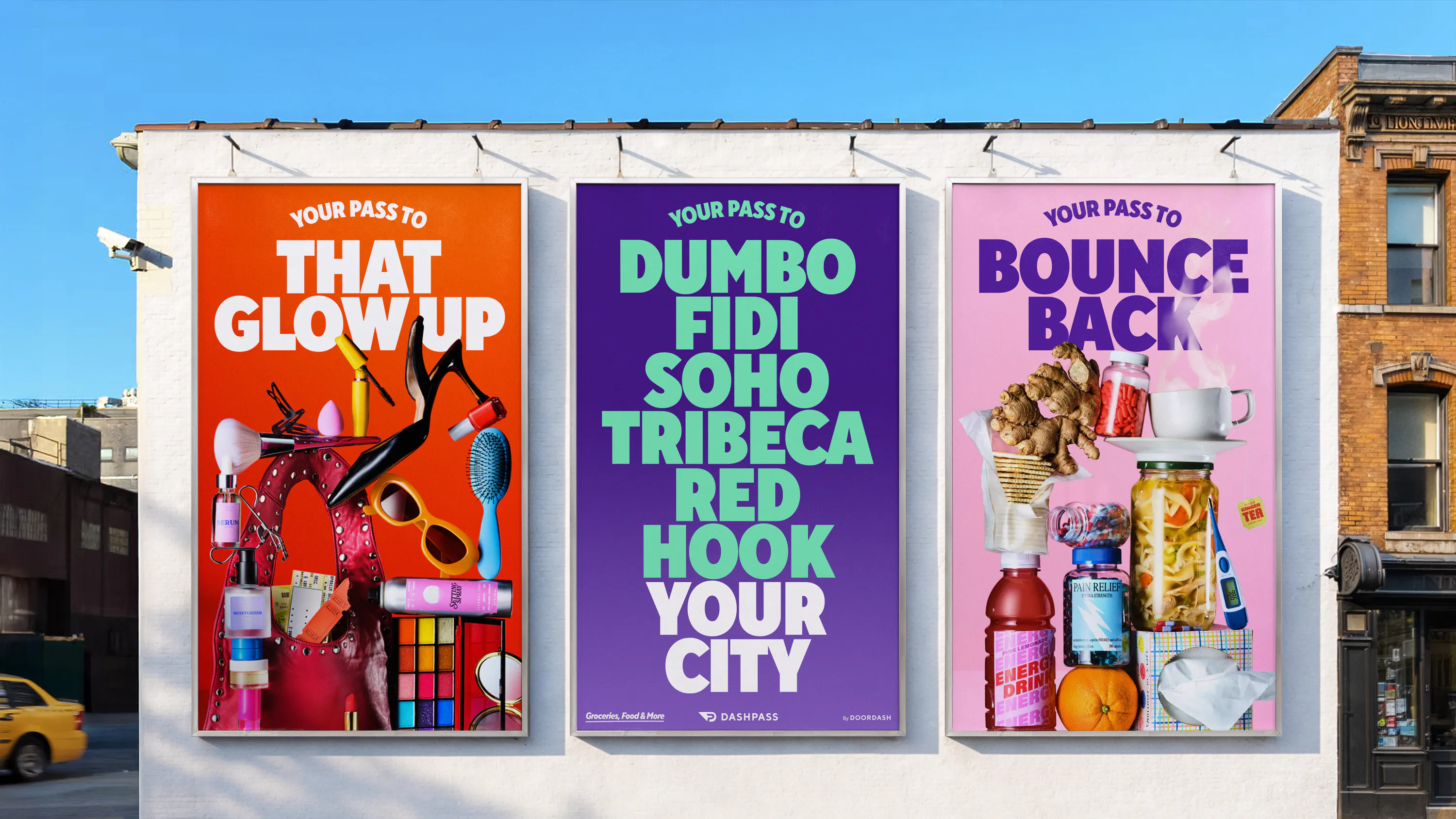
Solution
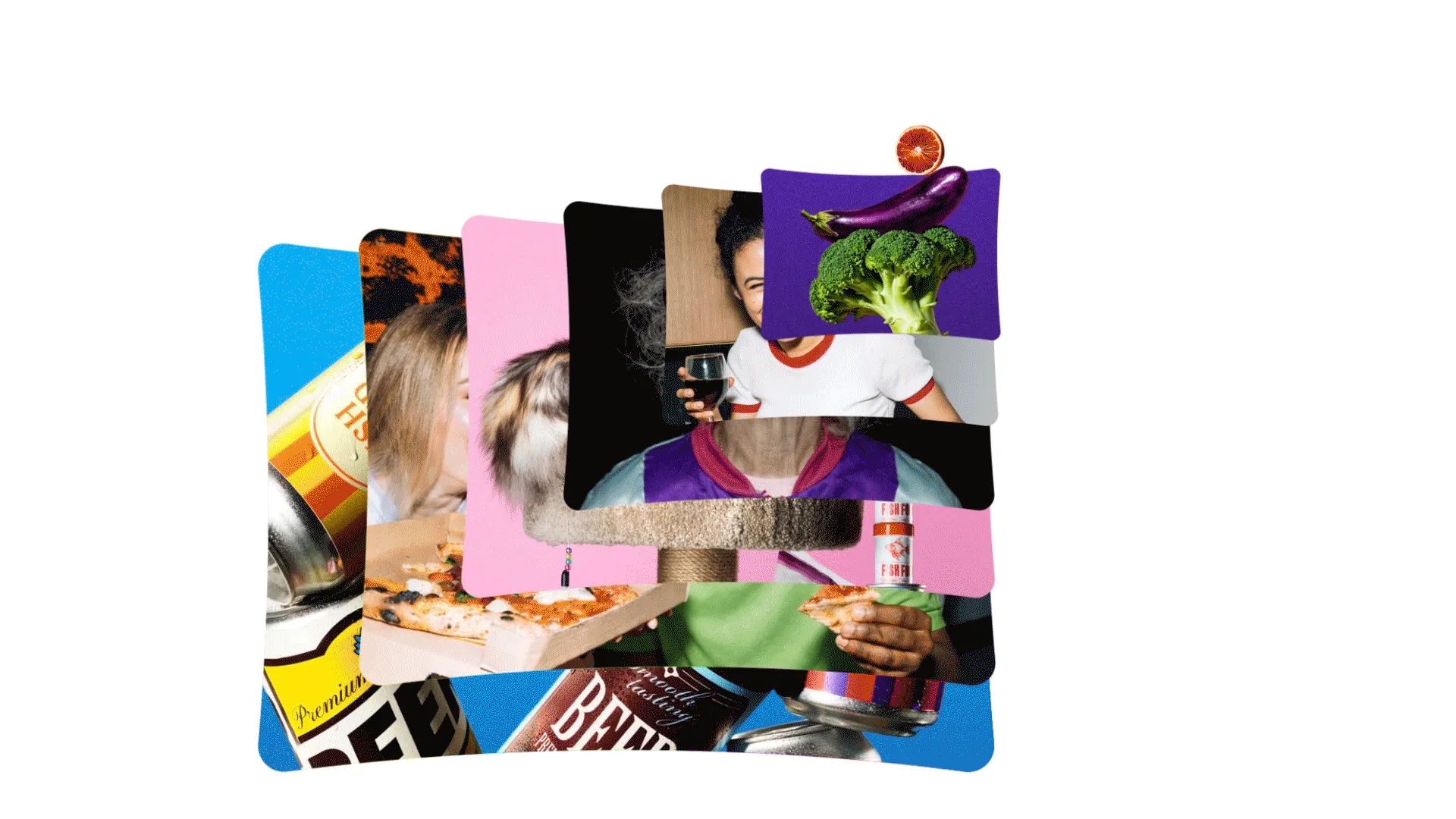
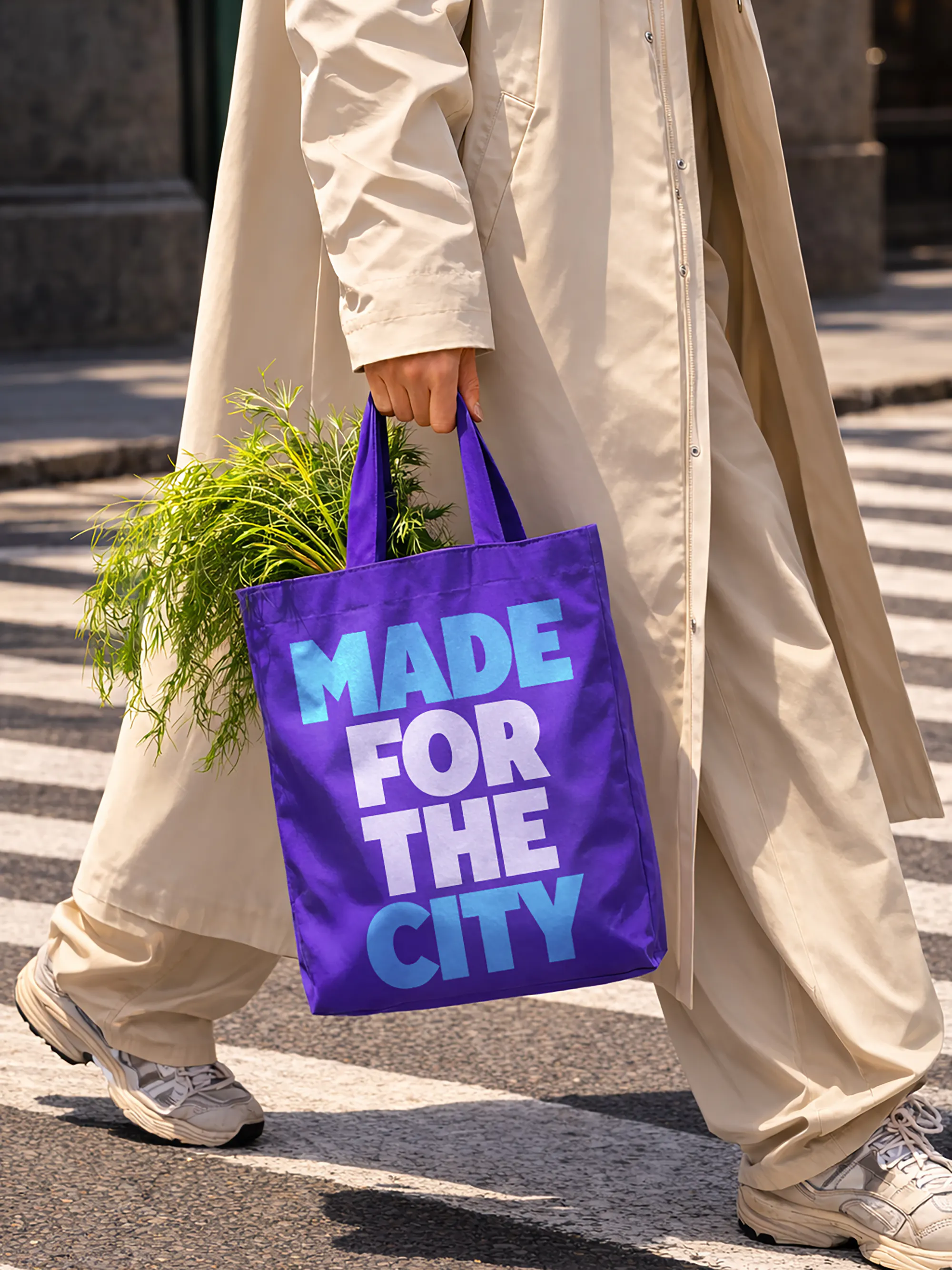
More color. More life. More to discover. Created by BaseNYC, the new DashPass identity embraces abundance as a language. Built around the idea “Your Pass to More,” it turns generosity into something you can see and feel. A dynamic “Pass” frame becomes a window into everything that’s nearby, a flexible device that captures the richness of what DashPass unlocks, from local gems to daily essentials. A distinctive purple leads the system, bold and energetic, expanding into a vibrant, multi-colored palette that reflects the diversity of neighborhoods across the U.S. The typographic system is elevated by pairing DoorDash’s TT Norms with a new expressive, condensed headline style, bringing added energy, clarity, and impact across every touchpoint. Photography leans into proximity, celebrating the everyday through playful, abundant still lifes that feel sourced from just down the street. The result is an identity that scales without losing its human touch, so much so that its visual and verbal language went on to influence the broader DoorDash brand. A brand that feels big, but never distant. DashPass connects you to more. More of what’s around you, closer than ever.
Some services deliver. Others open doors. DashPass, DoorDash’s all-access membership program, was built to do both, quietly expanding what the platform could offer, from meals to everyday essentials. But as its universe grew, so did its meaning. What started as a benefit became something broader, richer, more embedded in daily life. Not just access, but access to more of more. More places, more possibilities, more of what makes a neighborhood feel alive. From corner stores to cult favorites, from last-minute needs to small indulgences, DashPass sits at the intersection of scale and proximity. A national platform, rooted in local rhythm. The opportunity was to give that feeling a form.
{kind=image}
{kind=image}
{kind=image}
{kind=image}
{kind=image}
{kind=image}
{kind=image}
{kind=image}
{kind=image}
{kind=image}
{kind=image}
{kind=image}
{kind=image}
{kind=image}
{kind=image}
{kind=image}
{kind=image}
{kind=image}
{kind=image}
{kind=image}
{kind=image}
{kind=image}
{kind=image}
{kind=image}
{kind=image}
- Creative DirectionMin Lew
- DesignRoss Gendels, Carlos Bocai, Darius Wang, Craig Parsons
- Project ManagementHarry Laverty, Shannon Wilcox
- Case Study DesignLorena Ortiz
- TypographyType Type
{kind=image}
{kind=image}
{kind=image}