{kind=image}
Ray's WaterfrontFRESH CATCHES & WARM WELCOMES
A new chapter for a local Alaskan legend
Context
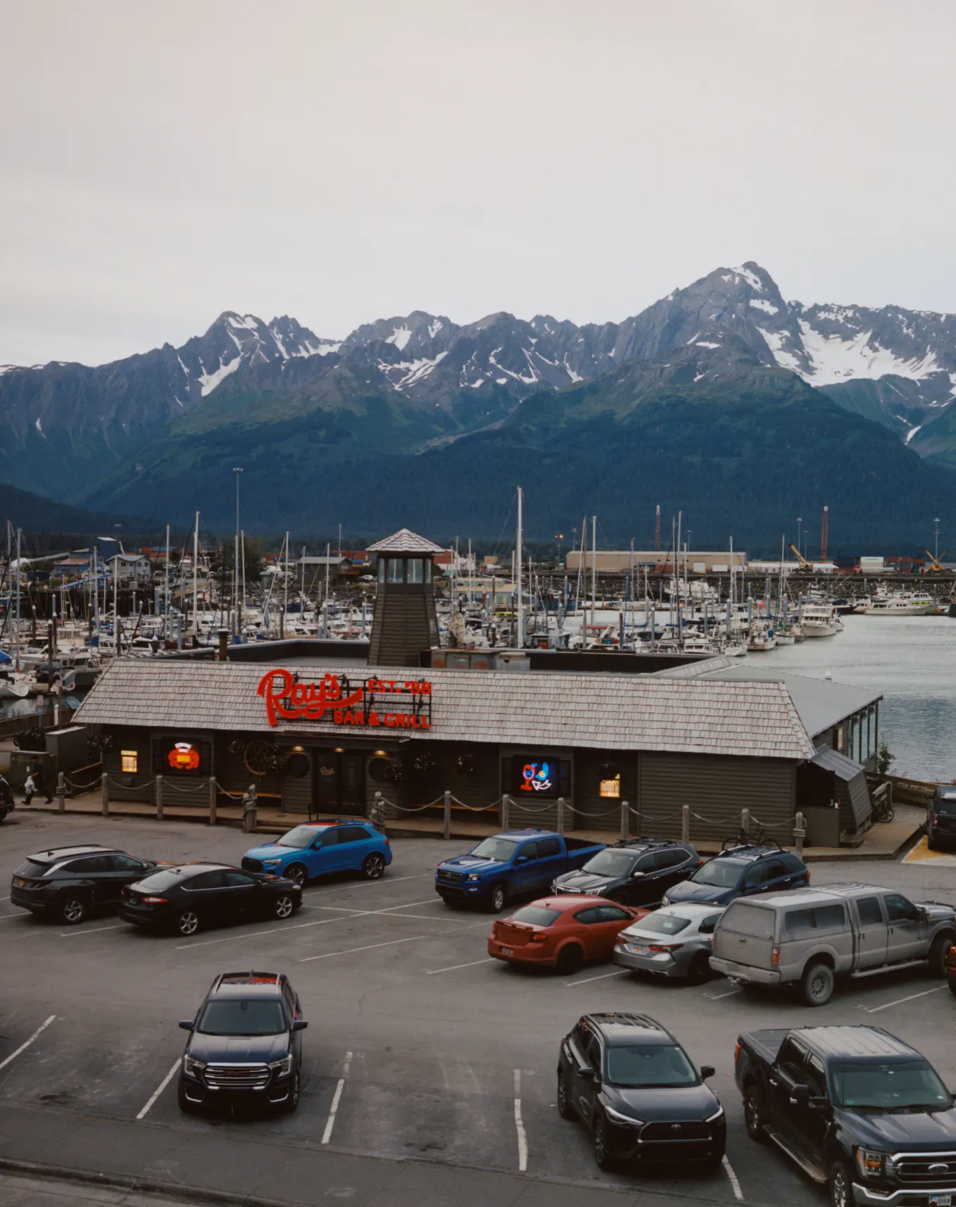
Seward, Alaska. Population: 2,735. Nestled against the Small Boat Harbor on Resurrection Bay stands Ray’s Waterfront: a family-run restaurant and a fixture of the town since 1988.
Built on familiarity and consistency, Ray's has become a community hub, serving generations of locals and welcoming tourists year after year. Founded by Ray and Leslie Simutis, it grew from a life built around adventure: Ray, a former New York taxi driver turned commercial fisherman, and Leslie, a trained cook with a love of local seafood. Ray held court in the bar, Leslie ran the kitchen.
When ownership passed to the next generation – their daughters Anna and Nina – well worn and well loved, it was time to polish the decks.
Challenge
You can't fake Ray's. Already thick with character, it carries an atmosphere new establishments try to recreate but never quite can. A restaurant built on family memories and lived experience, our task was not to "refresh" it conventionally.
Instead, the work was to unearth the many layers of Ray's history and weave them into an identity that feels contemporary yet timeless. To tell a story about family and place, honour the past, and build a platform for the future under Anna's stewardship. Whatever we created needed to speak to locals and first-timers alike. And always present was Ray himself: larger than life, impossible to ignore.
Solution
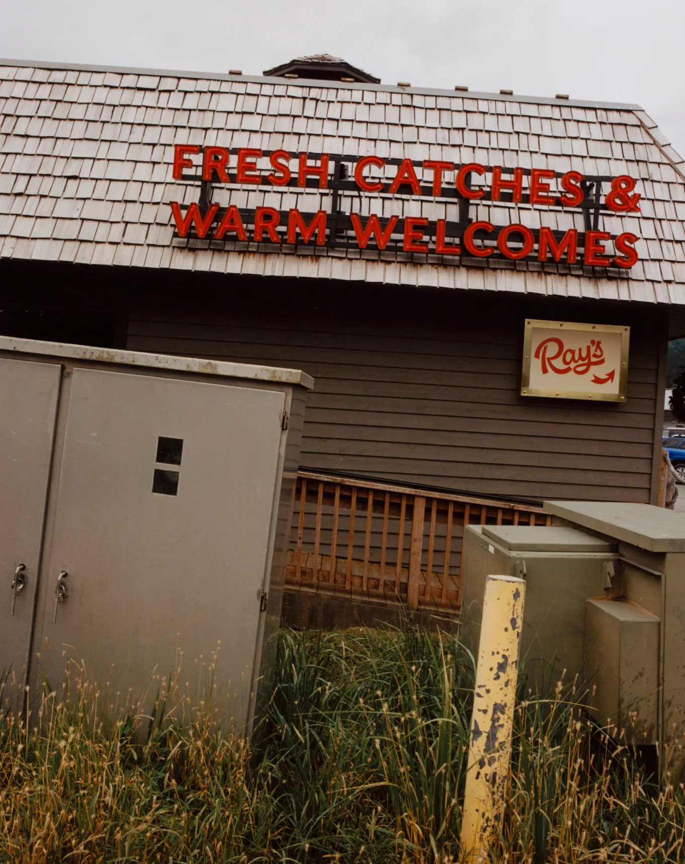
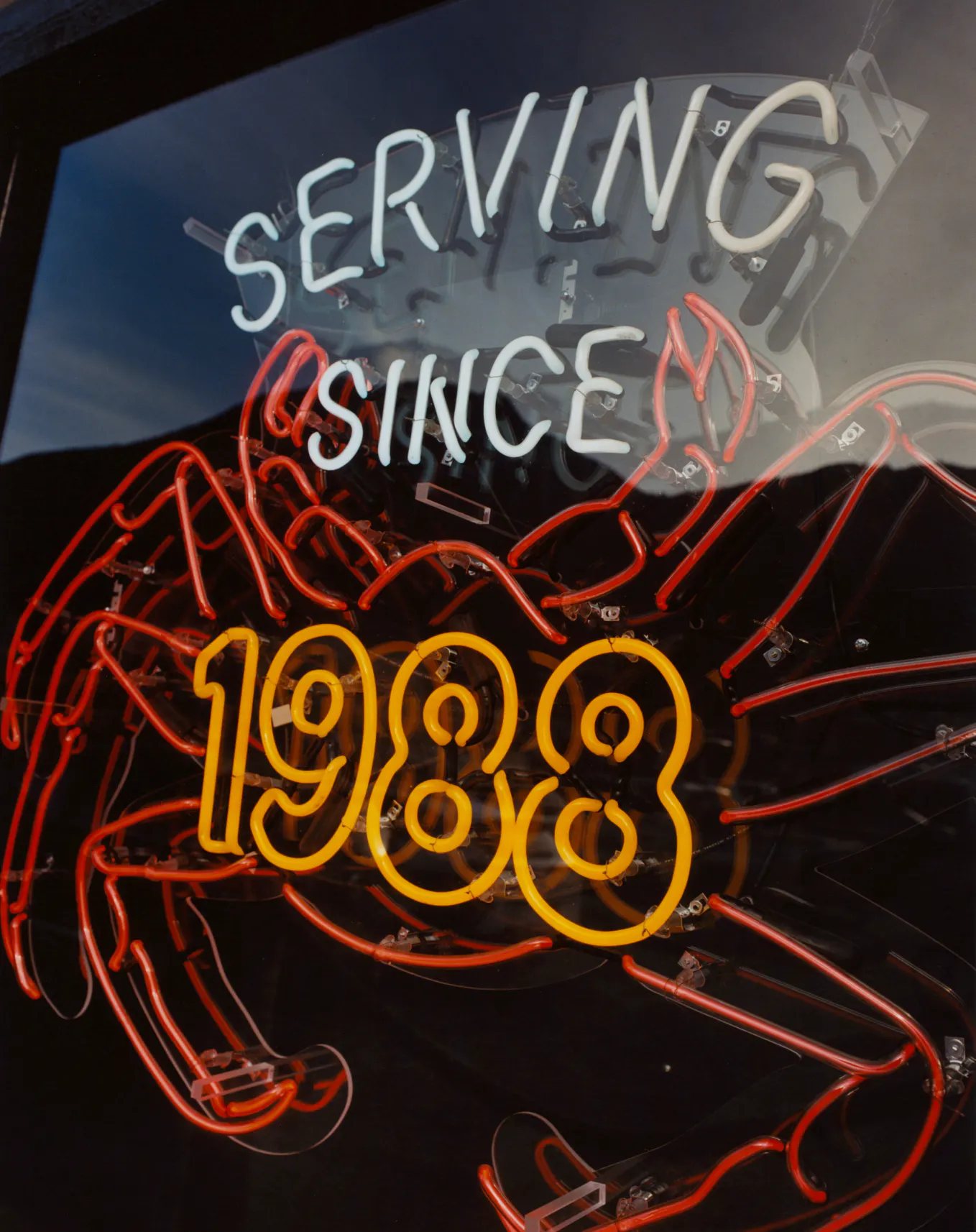
It began with an old neon sign hanging in the window, all that remained from the original brand. That glow became our anchor, a nod to Ray's beginnings and its enduring warmth. We redrew the logo from its original letterforms, sharpening its edges just enough to feel fresh while retaining its well-worn flair. From there, the mark was extended across a family of iterations and lockups, including a custom rope version that nods to Ray’s maritime roots.
From there, the visual world grew naturally. Drawing on home and family, the identity explores Ray as both individual and institution. A spirit of hospitality sits at its core — expressed across menus, printed ephemera, the website and interiors through patterns, colours, tchotchkes and old family photos. Alongside these, illustrations by Jake Foreman reinterpret lived moments with warmth and character. Together, these elements layer like a scrapbook built over decades, forming a visual language shaped by memory, repetition and care.
Ray’s architecture blends maritime references, harbourside diner charm and small-town Alaskan pragmatism, so the signage needed to feel like it belonged. For inspiration we returned to original family photos from the 80’s featuring oversized red neon channel letters glowing against weathered shingles. Working with Tim Zamberlin of National Sign Corp, Seattle’s oldest and most trusted sign maker, BaseMEL brought those details back to life on the façade, setting the tone for an interior that feels welcoming, familiar and unmistakably Ray’s.
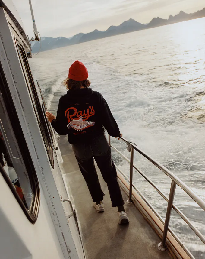
To capture the next chapter, we commissioned Jack Bool to document the restaurant in its working rhythm: the textures, the people, the moments that make it real, and the harbour town that holds it.
The process was collaborative from the outset, shaped by a small team bringing care to a place that already meant so much to its community. The result is a renewed Ray's, grounded in its past and confidently set for its next chapter.
Seward, Alaska. Population: 2,735. Nestled against the Small Boat Harbor on Resurrection Bay stands Ray’s Waterfront: a family-run restaurant and a fixture of the town since 1988.
Built on familiarity and consistency, Ray's has become a community hub, serving generations of locals and welcoming tourists year after year. Founded by Ray and Leslie Simutis, it grew from a life built around adventure: Ray, a former New York taxi driver turned commercial fisherman, and Leslie, a trained cook with a love of local seafood. Ray held court in the bar, Leslie ran the kitchen.
When ownership passed to the next generation – their daughters Anna and Nina – well worn and well loved, it was time to polish the decks.
{kind=image}
{kind=image}
{kind=image}
{kind=image}
{kind=image}
{kind=image}
{kind=image}
{kind=image}
{kind=image}
{kind=image}
{kind=image}
{kind=image}
{kind=image}
{kind=image}
{kind=image}
{kind=image}
{kind=image}
{kind=image}
{kind=image}
{kind=image}
{kind=image}
{kind=image}
{kind=image}
{kind=image}
{kind=image}
{kind=image}
{kind=image}
{kind=image}
{kind=image}
{kind=image}
{kind=image}
{kind=image}
{kind=image}
{kind=image}
{kind=image}
{kind=image}
{kind=image}
{kind=image}
{kind=image}
{kind=image}
{kind=image}
{kind=image}
- Creative DirectionCaroline Cox
- Art DirectionCaroline Cox, Rachel Chew
- DesignRachel Chew
- Motion DesignLev Berry
- Digital Design & DevelopmentRachel Chew, Brigette Cantarella, Vincent Owen, Jake Bonin
- Project ManagementSamuel Bourke
- IllustrationJake Foreman
- Location PhotographyJack Bool
- Folio Photography:Annika Kafcaloudis
- Signage productionNational Sign Corp.
{kind=image}
{kind=image}
{kind=image}