{kind=image}
The New York Times: Food FestivalJoy of Cooking
All the best ingredients for a visual feast
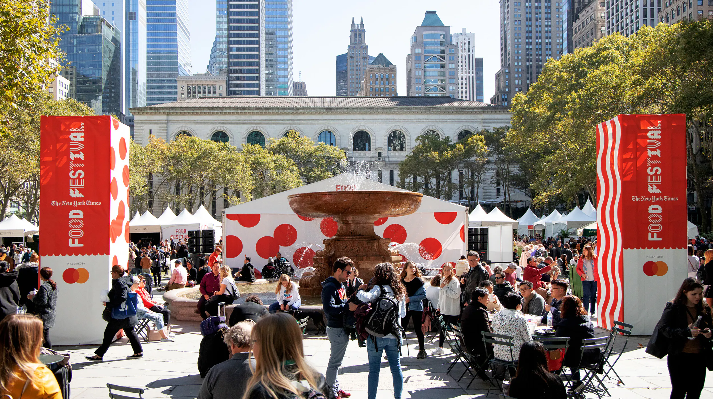
The first New York Times Food Festival aimed to democratize the news organization’s culinary content, by assembling top chefs from across the city for two days of public tastings, talks, and activities. Enticing the masses with a playful and festive identity, and a liberal serving of red, the sold-out event brought New Yorkers of all ages and backgrounds to enjoy food together in Bryant Park.
NYT Cooking hosted its inaugural three-day Food Festival in one of NYC’s most beautiful locales, Bryant Park, bringing together the cream of New York's culinary scene for an “IRL experience” created to feel approachable and inclusive for attendees. A unique environment, identity and digital platform were all pivotal in achieving this while explaining, quite literally, what’s cooking.
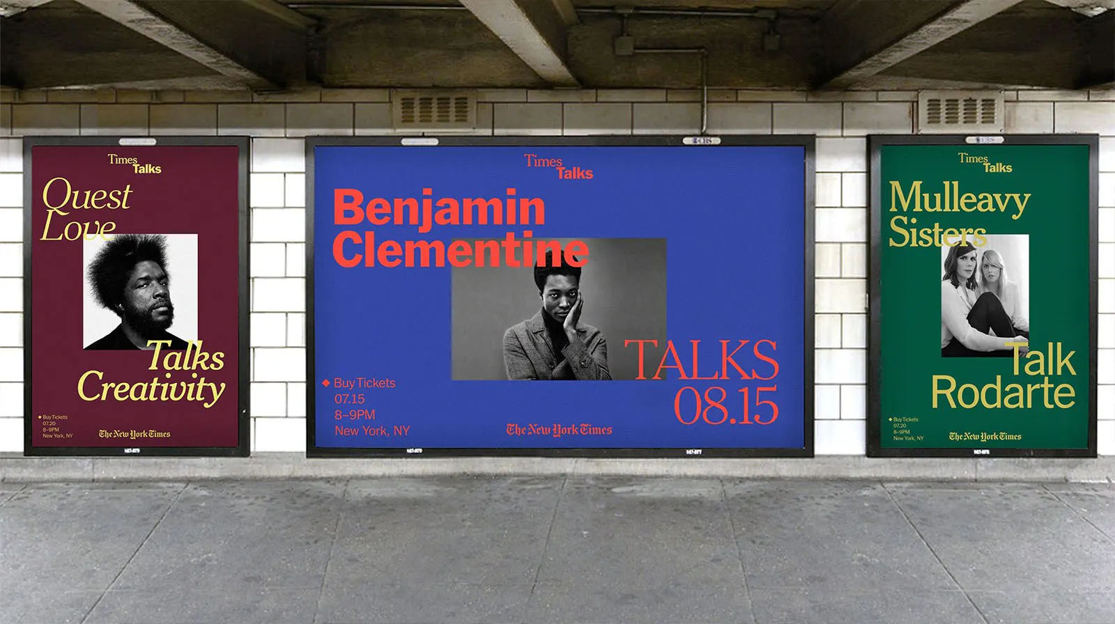
The festival’s trio of events – The Park, The Talks and The Nights – celebrated food cultures and presented personal behind-the-scenes stories in distinct ways. Therefore, each required a unique voice and treatment, while still legible as part of a coherent system. We approached this like a set of ingredients that come together to make a meal, using playful and spontaneous graphic elements and gestures to represent the varied flavors of the events – all united by the color red.
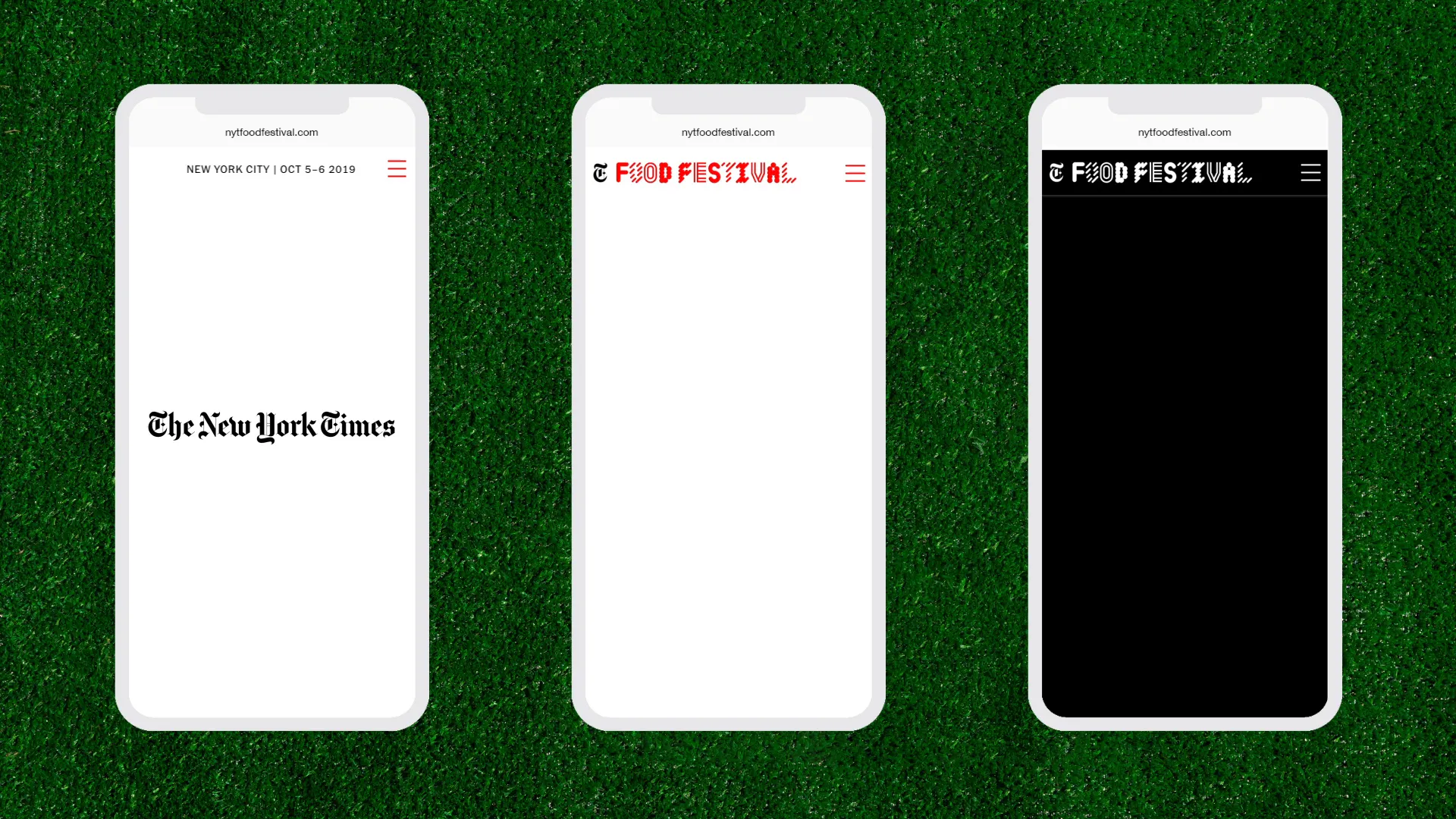
For The Park, the web page mimicked the experience of discovering the myriad stalls at Bryant Park, via a grid structure that showcased each chef/restaurant with animations and images. The Talks page was designed with a more editorial feel that reflected the planned conversations, with modules across two columns activated by hovering over the hyperlinks.
Finally, The Nights page that listed evening activities was reversed in black, with a single column used to translate the intimate and bespoke quality of each dinner. Bringing it all together are small surprises scattered throughout the website, imbuing a sense of serendipity and fun.
Through its iconicity and festivity, the identity appealed to all of New York’s food fanatics and expanded the NYT’s subscriber base to include a broader audience. Tickets for the festival itself sold out in days, The Nights was fully booked within 24 hours, and the at-capacity festival garnered substantial media coverage. The proof of the identity’s success is therefore in the pudding.
The first New York Times Food Festival aimed to democratize the news organization’s culinary content, by assembling top chefs from across the city for two days of public tastings, talks, and activities. Enticing the masses with a playful and festive identity, and a liberal serving of red, the sold-out event brought New Yorkers of all ages and backgrounds to enjoy food together in Bryant Park.
NYT Cooking hosted its inaugural three-day Food Festival in one of NYC’s most beautiful locales, Bryant Park, bringing together the cream of New York's culinary scene for an “IRL experience” created to feel approachable and inclusive for attendees. A unique environment, identity and digital platform were all pivotal in achieving this while explaining, quite literally, what’s cooking.
The festival’s trio of events – The Park, The Talks and The Nights – celebrated food cultures and presented personal behind-the-scenes stories in distinct ways. Therefore, each required a unique voice and treatment, while still legible as part of a coherent system. We approached this like a set of ingredients that come together to make a meal, using playful and spontaneous graphic elements and gestures to represent the varied flavors of the events – all united by the color red.
For The Park, the web page mimicked the experience of discovering the myriad stalls at Bryant Park, via a grid structure that showcased each chef/restaurant with animations and images. The Talks page was designed with a more editorial feel that reflected the planned conversations, with modules across two columns activated by hovering over the hyperlinks.
Finally, The Nights page that listed evening activities was reversed in black, with a single column used to translate the intimate and bespoke quality of each dinner. Bringing it all together are small surprises scattered throughout the website, imbuing a sense of serendipity and fun.
Through its iconicity and festivity, the identity appealed to all of New York’s food fanatics and expanded the NYT’s subscriber base to include a broader audience. Tickets for the festival itself sold out in days, The Nights was fully booked within 24 hours, and the at-capacity festival garnered substantial media coverage. The proof of the identity’s success is therefore in the pudding.
{kind=image}
{kind=image}
{kind=image}
{kind=image}
{kind=image}
{kind=image}
{kind=image}
{kind=image}
- Creative DirectionMin Lew
- DesignInva Cota, Anthony Zukofsky, Joseph Han, Miebi Iyeyemi, Gabriela Carnabuci
- Strategy & Copywriting
- Digital Design & DevelopmentMirek Nisenbaum, Anthony Zukofsky
- Project ManagementJake Post
{kind=image}
{kind=image}
{kind=image}