Article
80s seafood spot Ray’s is a masterclass in earnestness done well
{kind=image}
BP&O features Base’s rebrand of Ray’s Waterfront, a family-run Alaskan seafood restaurant founded. Rooted in the restaurant’s history, architecture and small-town character, the identity celebrates nearly four decades of local heritage through design, storytelling and a deep sense of place.
Article
Brands are turning to football nostalgia ahead of the World Cup
{kind=image}
Ahead of the 2026 World Cup, BaseNYC Partner Geoff Cook speaks with Glossy about how brands are tapping into football nostalgia, drawing on iconic football memories and design language to shape new campaigns across fashion and sportswear.
Interview
BASE DESIGN'S FOUNDING FATHERS DISCUSS THE STUDIO'S BEGINNINGS
{kind=image}
Base Co-Founders & Partners Dimitri Jeurissen and Thierry Brunfaut sat down with Developments to discuss Base's beginnings and building an international network of studio. The two reflect on more than 30 years of collaboration, and the evolution of their collective creative practice.
Article
Top Designers Used Chocolate Wrappers as a Canvas for AGI 2025
{kind=image}
DIELINE features BaseSGN’s initiative for AGI Open 2025, in partnership with Marou Chocolate, bringing together 100 designers to each design a chocolate bar wrapper exploring the theme “ĐÂY – here and now,” later auctioned to support Saigon Children’s Charity.
Interview
How to Balance your Convictions with your Career
{kind=image}
BaseBRU Senior Designer Aurélia de Azambuja speaks with Creative Review about how she remains committed to her personal values while meeting client needs.
Article
Falling Ap’art, new identity for Yield Strengh by Base Design
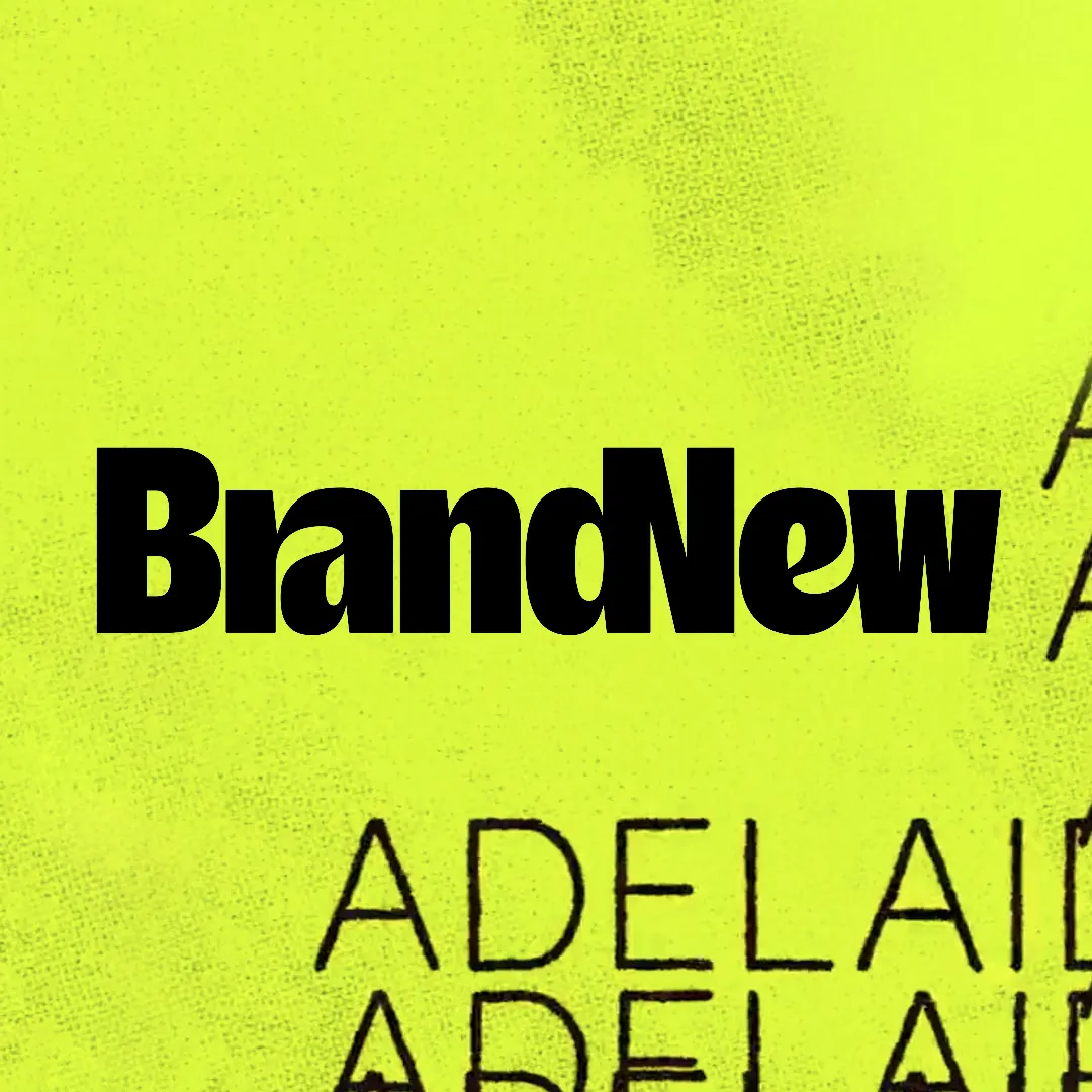{kind=image}
Brand New features BaseMEL's identity for Yield Strength, where a constantly evolving typeface turns the visual identity for this year's theme of the Adelaide Biennial of Australian Art into a living expression of the biennial's themes of pressure and transformation.
Article
15 studios creatives are excited about right now
{kind=image}
Creative Boom includes Base as one of the 15 studios the creative community is most excited about right now, as highlighted in its annual State of Creativity survey, based on responses from over 1,000 creatives.
Article
Always be Closing, new identity for CloseCo by Base Design
{kind=image}
Brand New features BaseMEL's identity for CloseCo, built around “close company” living. A warm typographic system, custom ligatures, and a soft visual language coming together — with a cozy palette and structured layouts balancing comfort with clarity.
Article
Is it ethical to present concept work as if it's real?
{kind=image}
Is it ethical to present concept work as if it's real? BaseNYC Creative Director Carlos Bocai joins Creative Boom's discussion on speculative projects — how to show them, when, and the right balance to find with real-life experience.
Article
POV: Ballet and opera need to get radical to stay relevant
{kind=image}
Base Partner Thierry Brunfaut shares with It's Nice That why ballet and opera institutions need to get radical to stay relevant and reconnect with contemporary audiences — by challenging perceptions of elitism, accessibility, and cultural distance.
Article
Flow and Overflow: Base Design’s Holistic Vision for Kanal
{kind=image}
PRINT Magazine features BaseBRU's identity for KANAL, with BaseBRU Partner & ECD Dimitri Jeurissen and BaseBRU Design Director Thomas Leon discussing a holistic “Flow and Overflow” system designed to evolve with the institution.
Article
The best brands think like entertainment studios
{kind=image}
From advertising to world building: The best brands think like entertainment studios. BaseNYC Partner Geoff Cook looks for Shots at the ways in which forward-thinking brands are creating content that embodies their products.
Article
Green is the new black: how matcha went mainstream
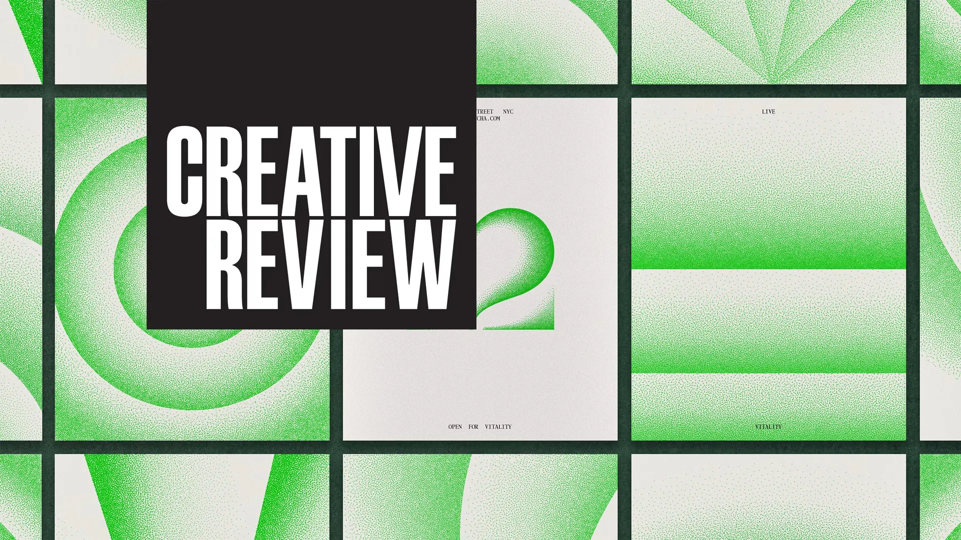{kind=image}
BaseNYC Managing Partner & ECD Min Lew speaks with Creative Review about green being the new black — matcha’s rise to a cultural status drink, shaped by a health-conscious and visually fluent generation.
Interview
New beginnings: The agencies that are expanding globally
{kind=image}
Base Partner Thierry Brunfaut and BaseSGN Partner & ECD Joshua Breidenbach sat down with Creative Review to talk about expansion, building teams rooted locally, working globally, and what kind of creative evolution you can expect from the mix.
Article
Digital Magnetism: Online Branding in the Age of AI Sameness
{kind=image}
BaseNYC Partner and Digital Director Mirek Nisenbaum writes in Belgian Branding on online branding in the age of AI sameness and the growing challenge of standing out in a convergent digital landscape.
Article
Base Design builds a brand that breathes for Kanal
{kind=image}
Not a traditional museum and an identity that doesn’t treat it like one — Creative Boom spotlights Kanal's identity by BaseBRU. A system spanning visual, sonic, and behavioural layers, designed to flex as the institution grows.
Interview
Reimagining Kanal as a fluid, multisensory extension of the city
{kind=image}
Flow, motion, and a museum that feels like an extension of the city itself. BaseBRU Partner & ECD Dimitri Jeurissen and BaseBRU Design Director Thomas Léon shared with Communication Arts how BaseBRU shaped KANAL's identity.
Interview
Geoff Cook: “Net New” Creative Work
{kind=image}
In conversation with Jonah Ginsburg of DesignLabs, BaseNYC Partner Geoff Cook discusses why the future belongs to “net new” creative work, AI in the studio, and the ambition behind projects like 12 and Printemps.
Article
On KANAL's identity
{kind=image}
BP&O spotlights KANAL' s identity, Brussels' future museum of modern and contemporary art — exploring how a bespoke variable typeface and an open duotone colour system shape a flexible identity designed to evolve with the institution’s multidisciplinary programme.
Article
Base unveils dynamic identity for major new Brussels art museum
{kind=image}
Creative Review features BaseBRU's identity for KANAL, Brussels' new museum of modern and contemporary art. BaseBRU Partner & ECD Dimitri Jeurissen and BaseBRU Design Director Thomas Leon share their insights on shaping a fluid brand system positioning the museum as a living cultural organism.
Article
Highlands Coffee Brews Up a Bold Wordmark and Ascendant Peaks
{kind=image}
Dieline features BaseSGN’s packaging design for Vietnamese coffee brand Highlands Coffee. The project uses scale and bold typography to turn the brand name into a structural element, supported by layered colors that reference roasting depth and origin.
Interview
Min Lew on 'Lived data' in the creative process
{kind=image}
BaseNYC Managing Partner & ECD Min Lew joins Ben Tallon on The Creative Condition podcast to discuss creativity, leadership, and “lived data”: the intuition built through experience, culture, and close observation.
Article
How AI Shopping Could Turn Fashion Advertising on its Head
{kind=image}
BaseNYC Partner and Digital Director Mirek Nisenbaum shares his perspective with Vogue Business on how AI-driven shopping could reshape fashion advertising and brand visibility and how brands need to rethink attention, relevance, and meaning as discovery becomes increasingly automated.
Article
The Global Branding Trap CEOs Keep Falling Into
{kind=image}
A.I. makes the world feel smaller. Brands, faster. Decisions, centralized. But does any of that actually bring you closer to people? In his latest Observer piece, BaseNYC Partner Geoff Cook makes the case for local culture as the foundation for relevance, growth, and meaningful connection.
Interview
How to Build Your Brand as an Executive and Why it Matters
{kind=image}
From cultural institutions to emerging founders, BaseNYC Partner Geoff Cook shares with Authority Magazine on leadership, authenticity, and the mindset shifts executives need to build brands that endure.
Interview
Design with meaning vs Design with feeling
BaseNYC Associate Creative Director Ross Gendels sits down for an interview with Studio Indice to explore the tension between meaning and feeling in design — from emotion-led concepts to why some projects start with a vibe rather than a brief, offering an inside look at world-building, not just branding.
Interview
Mark Bain on Rooster Beers' packaging
{kind=image}
From color pulled off Saigon sidewalks to a rooster that finally sounds like one, BaseSGN Design Director Mark Bain unpacks the choices behind Rooster Beers’ street-born identity in Communication Arts.
Interview
The Business of Creative Leadership
{kind=image}
BaseNYC Partner Geoff Cook sits down with Chris Do on The Future podcast for “The Business of Creative Leadership,” discussing world-building, strategy, and how brands take shape.
Article
Designing Democracy
{kind=image}
Design has always been political, shaping how power is seen. BaseNYC Partner & Executive Creative Director Min Lew discusses in PRINT Magazine how design influences what people see, feel, and believe.
Interview
Aurélia De Azambuja on the quiet power of design
{kind=image}
From the stage at Forward Festival 2025 in Vienna to the pages of CC/Magazine, BaseBRU Senior Designer Aurélia de Azambuja explores design as a tool for social and cultural change, and its role in shaping perception in a hyperstimulated world.
Interview
World-Building Brands in an AI Era
{kind=image}
BaseNYC Partner Geoff Cook joins the OnBrand podcast with host Nick Westergaard to explore the art of world-building in branding, drawing on projects from The Museum of Modern Art to Milk, 12, and JFK Terminal 4.
Interview
Becoming BaseSaigon
{kind=image}
With the launch of BaseSaigon, Joshua Breidenbach (Partner & ECD) and Chí-An De Leo (Partner & CEO) reflect on a new chapter for the former Rice Studios and the opportunities ahead within the Base network.